カテゴリー: archive

  • 2024

    2024

    あけましておめでとうございます。
    Happy new year

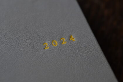
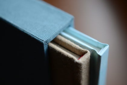
    2024年のスケジュール帳を改装した年末年始。
    新たな相棒、箔押し機を使いこなすための練習も兼ね、
    2023年に学んだ技術を詰め込んだ製本にしました。

    It’s the year-end and New Year holidays
    that have been renovated from the 2024 schedule book.
    I have renovated it to incorporate the techniques we learned in 2023.
    It also serves as a practice to master the use of my new partner, the foil stamping machine.

    失敗続きだったドイツ装も、だいぶ作り慣れてきました。
    丈夫な革を背に、布を平に使うのが良いと思います。
    では、逆だとどうなるか?
    作って、使って、試してみます。

    I’ve gotten used to making the German version, which I had a series of failures with.
    I think it’s better to use durable leather for the back and cloth for the cover.
    What happens if it’s the other way around?
    I will make it, use it, and try it out.

    角は革を漉いて菊寄せ。
    昨年習った技術の復習です。

    The horns are made of leather and kikuyose.
    I will review the techniques we learned last year.

    スピンは元からついていたものを再利用。
    花布は箔押しの色に合わせました。

    Spin reuses the original one.
    The headband matches the color of the foil stamping.

    背は藍の生葉染めの綿布。
    友人である作家ケシキの手染めです。
    藍は褪色が激しいので、そこも試してみます。
    背のど真ん中に、真っ直ぐ、箔押しの練習。

    The back is made of indigo leaf-dyed cotton cloth.
    Hand-dyed by my friend, the artist Keshiki.
    Indigo fades quickly, so I will experiment with that as well.
    This is a practice of stamping the foil straight down the center of the back.

    災害による2024年の幕開け。
    本の修理ができるようになりたくて、今の製本教室の扉を叩きました。
    安価で大量に素早く供給される工業的製本技術は素晴らしい。
    しかし、廃盤になった本、思い出の一冊は替の効かないものです。
    一冊ずつ、1人ずつに対応できるのが手製本だと思っています。
    目標は本の修理。
    そのための基礎をしっかりと固めて、積み上げていきたいものです。

    The year 2024 began with a disaster.
    I wanted to be able to repair books,
    so I knocked on the door of my current bookbinding class.
    Industrial bookbinding technology is wonderful
    because it is inexpensive and can be quickly supplied in large quantities.
    However, a book that is out of print or a book of memories cannot be replaced.
    I believe that hand-binding allows me to respond to each person, one book at a time.
    I want to solidify the foundation for this and build upon it.

  • The Bookbinding Cafe is open 製本カフェオープンします

    The Bookbinding Cafe is open 製本カフェオープンします

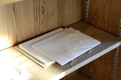
    Text paper in the middle of binding.
    綴じかけの本文用紙。

    A lot of people came to the pre-opening of the bookbinding cafe the other day.
    I sincerely thank you.

    先日は製本カフェ試食会に、予想以上の方にお越しいただきました。
    本当にありがとうございます。

    I exhibited bookbinding tools.
    製本道具を展示しました。

    A bookbinding cafe is a cafe for making books.
    It is a cafe as an entrance for those who are interested in books.
    I also sell bound albums, notebooks and stationery.
    The cafe offers cheesecake, coffee, tea and apple juice.

    製本カフェは本づくりのためのカフェです。
    本に興味のある人の入口としてのカフェです。
    製本したアルバム、ノートや文房具の販売もあります。
    カフェのメニューは、チーズケーキとコーヒー、お茶、リンゴジュースです。

    These are notebooks to be sold and half-finished.
    販売予定のノートと作りかけのノート。
    Past productions.
    過去に作った物。
    On this day, we also made it possible to experience calligraphy.
    この日はカリグラフィー体験もできるようにしました。

    I will open once a month from this month.
    Well, here’s the announcement of the 1th opening day.

    今月から毎月一回オープンいたします。
    それでは、第1回目のオープンのお知らせです。

    日時 ▶︎ 3月26日 (日曜) 11:00-18:00
    場所 ▶︎ 旧八女郡役所内 kitorasu  〒834-0031 福岡県八女市本町2−105

    Date and time ▶︎ Sunday, March 26, 11:00-18:00
    Location ▶︎ kitorasu, inside the former Yame-gun government office
         2-105 Honmachi, Yame City, Fukuoka Prefecture 834-0031

    I hope it will be a time to read a book slowly and open a notebook quietly.
    ゆっくりと本を読んだり、静かに手帳を開いたりする時間となりますように。

  • Start a bookbinding cafe 製本カフェをはじめます

    Start a bookbinding cafe 製本カフェをはじめます

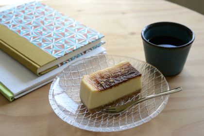
    This is a cheesecake that will be offered at a bookbinding cafe.
    製本カフェで提供する予定のチーズケーキ。

    It’s been a long time.
    It was a great experience for me to see and hear about bookbinding during my stay in Tokyo.
    After that, I was lucky enough to attend a bookbinding class in Fukuoka.
    Right now, I’m in the process of resolving questions that arise as the book is bound.

    ご無沙汰だったブログを書いています。
    東京滞在で、製本について見聞きできたのは大きな収穫でした。
    その後、縁あって福岡の製本教室に通っています。
    現在は、製本すればするほどに出てくる疑問を解決している真っ最中。

    The ones I bound for practice last year.
    昨年、練習に作ったもの。

    Then I noticed a change in my senses and sensibilities.
    So far, I’ve opened a store at events and planned events with someone.
    My challenge this time is to try it myself.
    I still haven’t decided what I want to do or what kind of bookbinding I want to do.
    I want to clarify that.

    すると、今度は自分の感覚や感性の変化に気がつきました。
    これまでは、イベントに出店したり、誰かとイベントを企画してきました。
    今回は、私1人でやってみることが一つの課題です。
    まだ自分がどうしたいのか、どんな製本がしたいのかが定まっていません。
    それを明らかにしたいです。

    This is my latest book.
    最近の製本。

    Also, I’ve been getting more questions about bookbinding.
    There is also a purpose of a place to respond to it.
    I would be happy if you could familiarize yourself with bookbinding.
    Of course, you are welcome even if you are not interested in books or bookbinding.
    I want you to read quietly, be absent-minded, and relax.

    また、製本に関する質問をもらうことが増えてきました。
    それに応えるための場でもあります。
    製本に親しんでもらえると嬉しいです。
    もちろん、本や製本に興味がなくても大歓迎。
    静かに読書したり、ぼんやりしたり、のんびりとくつろいでいただきたいと思っています。


    本番前の仮オープン、試食会を開催いたします。
    I will do a temporary opening before the performance.

    日時:3月3日 12:00 ~ 17:00
    場所:旧八女郡役所内 kitorasu
    カフェメニュー:チーズケーキと飲み物のセット ¥500 のみ
    * 飲み物は、ホットコーヒーとホット烏龍茶、冷たいリンゴジュースです。
    * この日は提供の練習のためお待ちいただく可能性がございます。
      そのため、サービス価格にしております。

    Date: March 3rd 12:00-17:00
    Location: kitorasu inside the former Yame-gun government office
    Cafe menu: Cheesecake and drink set only. 500 yen.
    * Drinks are hot coffee, hot oolong tea, and cold apple juice.
    * There is a possibility that you may have to wait for practice on this day.
      That’s why I have a service price.

  • Break time

    Break time

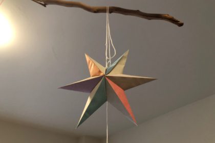
    Star.
    This place is a yoga studio and an atelier of artwork.
    The owner of this studio is Yogini and an artist.
    星。
    この場所はヨガスタジオでもあり、アートワークアトリエにもなります。
    このスタジオのオーナーはヨギーニであり、アーティスト。

    I have a lot of things I want to write,
    but take a break first, not in chronological order.
    書きたいことは溜まっていますが、
    時系列ではなく、先に休憩を。

    A dictionary recommended by her.
    The typefaces of various old books have been collected.
    彼女の推薦辞書。
    様々な古い書物の書体が採取されています。

    Take a look at her portfolio.
    Graphic design that looks at the mind and body adjusted by yoga.
    I was sleepy at the end of yoga.
    And during the last resting pose, I experienced a mysterious sleep.
    According to the teacher, it is proof that I was completely weakened.
    I felt like I was sleeping and awake.
    It was a sleep with clear thoughts.
    It was a feeling I had never experienced before, so I wanted to record it.

    彼女のポートフォリオを見せてもらいました。
    ヨガで整えた後に見るグラフィックデザイン。
    ヨガの最後には眠くなっていました。
    そして、最後の休息のポーズの間、不思議な眠りを体験したのです。
    先生いわく、完全に脱力できた眠りなのだそう。
    眠っているような、覚めているような。
    それでいて、クリアな思考を感じました。
    今までに体験したことのない感覚だったので、
    記録しておきたくて。

    The photos this time were taken with an iPhone.
    I had a single-lens reflex camera, but I didn’t put it out.
    今回の写真はiPhoneで撮影。
    一眼カメラを持っていたのに出すこともなく。

    Facebook informed me that I met her four years ago.
    It was just this season.
    In addition, I visited this atelier at this time of 2019.
    I feel like I’ve been connected to the present since three years ago.

    Facebookが彼女と出会ったのが4年前だと知らせてくれました。
    ちょうど今頃です。
    さらに、このアトリエを訪ねたのは2019年の今。
    3年前から今に繋がった気がしました。

    This is 3 years ago.
    There are many driftwoods and dried plants in her atelier.
    At that time, it was difficult to relax.
    これは3年前。
    彼女のアトリエには流木やドライになった植物がたくさんあるのです。
    あの頃は、力を抜くのが難しかったなぁ。
    Whenever I go to her, I go to this restaurant with her.
    I am satisfied with the delicious meal that uses plenty of fresh ingredients.
    彼女を訪ねると、いつも一緒にこのレストランへ。
    新鮮な食材がふんだんに使われた美味しい食事、毎回満たされます。

    I want to be a bookbinder in town.
    I am thinking of receiving an order to manufacture a book that is not suitable for mass production.
    I would like to receive an order for repairing books that are not cultural properties.
    I want to sell notebooks and make custom-made books.
    I’m very happy if you think that a town with a bookbinder is nice.
    I’ve been rushing until now,
    but it was an event that made me feel that
    I needed to get a little tidy toward my goal.
    Because there is no limit to bookbinding.
    What the world needs is not perfect binding.
    It is important to have good binding that is affordable and easy to use on a daily basis.
    Do not you think so?

    私は町の製本屋になりたいのです。
    大量生産には適さない製本を請け負うことを考えています。
    文化財ではない本の修理も受けていきたいです。
    ノートの販売もすれば、オーダーメイドの製本も作りたい。
    製本屋のある町ってなんかいいよねって思ってもらえると、すごく嬉しい。
    今まで遮二無二突っ走ってきましたが、
    ここらで目標に向かって整理整頓が必要だなぁと感じたできごとでした。
    だって、製本には際限がないんです。
    世の中に必要なのは完璧な製本ではありません。
    大切なのは、手の届く価格で、日常使いしやすい良い製本であること。
    なのではないでしょうか。


  • Slip case making workshop -Stay in Tokyo-

    Slip case making workshop -Stay in Tokyo-

    Flat surface with no irregularities.
    Right angle.
    If I say so myself, it’s good.
    凸凹のない平坦な表面。
    直角の角。
    我ながら上出来です。

    Another purpose of my stay in Tokyo is to study bookbinding and calligraphy.
    I received a workshop by Yonne, who I had been following on Instagram for a long time.
    It’s my first time to meet face to face.
    I am excited at the thought of seeing her.

    東京滞在でのもう一つの目的は、製本とカリグラフィーの勉強です。
    以前からInstagramでフォローしていたヨンネさんのワークショップを受けてきました。
    顔を合わせるのはこれが初めてです。
    ドキドキ…緊張…

    Books inside the case are free as long as they are within the specified size.
    I made a case of two books bound by myself.
    規定サイズ内であれば、ケースの中に入れる本は自由です。
    私は自分で製本した本2冊組のケースを作ります。

    There are many types of Yonne’s workshops.
    It covers a wide range of fields, from thread binding, book structure, book repair, to box making.
    I wish I could receive it during my stay in Tokyo.
    Fortunately, I had a seat at the slip case making workshop, so I applied immediately.

    ヨンネさんのワークショップにはたくさんの種類があります。
    糸かがり製本、本の構造について、本の修理、箱作りなど、多岐に渡ります。
    東京滞在中に受けることができたらいいな、と思っていました。
    運よく、スリップケース作りワークショップに空きがあったため、即座に申し込んだのです。

    Cardboard that becomes the core.
    芯材の厚紙。

    One of the problems with my bookbinding was cutting cardboard.
    I couldn’t cut the cross section straight.
    This time, this problem has been solved!
    The teacher gave me some tips.
    I succeeded in cutting out at a right angle!!
    The size of 3 sheets of cardboard is also perfect.

    私の製本技術の問題の一つが芯材のカットでした。
    どうしても断面を真っ直ぐに切れないのです。
    今回のワークショップでこれが解決しました!
    先生に真っ直ぐに切るコツを教わり、
    見事、直角に切り出すことに成功!
    3枚の厚紙のサイズも正確に揃いました。

    After cutting out the material, it is time to assemble.
    Check for size errors during the assembly process.
    Since the cardboard can be cut out accurately, a box with no unevenness can be created.

    材料の切り出しが終わると、組み立て工程です。
    組み立てながらサイズが間違ってないか確認します。
    厚紙を正確に切り出せているので、凸凹のない箱が作れます。

    When the base is ready, I will put the cover on it.
    下地ができたら、カバークロスを貼っていきます。

    It was completed!
    完成!!

    The corners are also beautifully finished.
    角も綺麗に仕上がりました。

    The size of the book and case is also perfect.
    Not too big, not too small.
    According to the teacher, books will last much longer if they are put in a box.
    I was able to learn not only how to make a slip case, but also basic techniques and information on bookbinding.
    It was a very fulfilling workshop.
    Thank you, Yonne.

    本とケースのサイズもぴったりです。
    大きすぎず、小さすぎず。
    先生によると、箱に入れることで本の耐久性は格段に良くなるのだそう。
    スリップケースの作り方だけでなく、製本の基本技術から製本に関する情報まで
    教わることができました。
    とても充実したワークショップでした。
    ヨンネさん、ありがとうございました。

  • A notebook to give to myself -Stay in Tokyo-

    A notebook to give to myself -Stay in Tokyo-

    It is a notebook that I have been interested in since I saw it on the web.
    It is a notebook of Ggouya.
    webで見た時から気になっていたノート。
    吾郷屋のノートです。

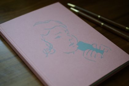
    Girl eating something.
    何かを食べる少女。

    The amazing part of this note is the cover with the paper-cutting.
    The cut out paper is fitted into the paper.
    The title is a girl who eats something.
    このノートの驚くべき部分、それは切り絵が嵌め込まれた表紙です。
    切り抜かれた紙が紙に嵌め込まれています。
    この絵のタイトルは、何かを食べる少女。

    According to Mr. Gogo, she is eating something like ”hamukatsu”.
    吾郷氏によれば、少女が食べているのはハムカツみたいな物なんだとか。

    Head band.
    Two colors are used to match the cover.
    花切。
    表紙に合わせた2色使い。

    It is sewn firmly.
    しっかりと編んであります。

    Two pens that are the buddies of this trip.
    Rosewood ballpoint pen, mechanical pencil.
    I want to be able to look good with something that I can love for a long time.
    この旅の相棒である2本の筆記具。
    ローズウッドのボールペンとシャープペンシル。
    永く愛せる良い品が似合うようになりたいもんです。

    An elaborate and beautiful bookbinding notebook.
    I thought I couldn’t make this myself, so I really wanted it.
    A notebook to give to myself
    Sometimes this kind of shopping is also good.
    Well, what should I write?
    本当に手の込んだ美しい製本。
    これは自分では作れないと思い、どうしても欲しくなりました。
    自分自身へ贈るノート。
    たまにはこういう買い物も良いもんだ。
    さて、何を書こうかな。

  • Bookstore / Seikatsu tsudurikata -Stay in Tokyo-

    Bookstore / Seikatsu tsudurikata -Stay in Tokyo-

    The front of the bookstore.
    Here is Bookstore / Seikatsu tsudurikata.
    書店の正面。
    こちらが本屋・生活綴方。

    I visited Fumiko Iyori, who I met at an event in Hirokawa Town,
    Fukuoka Prefecture in December 2019.
    When I met her, I heard that the bookstore
    she was involved in was rare and interesting,
    and I was following SNS of the bookstore.
    The name of the bookstore is “Bookstore / Seikatsu tsudurikata“.
    Seikatsu means living.
    Tsuzurikata is Japanese with two meanings: writing a sentence and binding a book.

    2019年の12月に福岡県広川町で開催されたイベントで
    知り合った伊従史子さんを訪ねました。
    出会った時にお聞きした、彼女が関わっている本屋の在り方が
    珍しくて興味深く、その本屋のSNSをずっとフォローしていました。
    その本屋の名前が、本屋・生活綴方です。
    生活とは暮らしという意味。
    綴方とは、文章を綴る、本を綴じるという二つの意味のある日本語です。

    Nearest station.
    最寄駅。

    From Tokyo to Yokohama.
    Get off at Myorenji Station on the Tokyu Toyoko Line.
    東京から横浜へ。
    東急東横線、妙蓮寺駅で下車します。

    You can see the temple gate immediately after exiting the central ticket gate.
    That is like Myorenji Temple.
    中央改札口を出てすぐにお寺の門が見えます。
    あれが妙蓮寺のようです。

    2 minutes walk from the station.
    I aim for it while looking at the delicious oden shops
    and Japanese sweets shops in the shopping district.

    駅から徒歩2分。
    商店街の美味しそうなおでん屋さん、和菓子屋さんに惹かれつつ
    生活綴方を目指します。

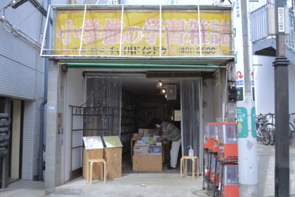
    I arrived without hesitation using this appearance that I saw on SNS.
    I heard later that it was originally a bookstore for children’s books.
    The old signboard is left as it is.

    SNSで見ていたこの外観を目印に迷わず到着です。
    後から聞いた話では、元々子供向けの本の本屋さんだった場所なんだそうです。
    昔の看板をそのまま残してあります。

    Near the entrance is a corner of books published by Seikatsu tsudurikata.
    Only the top is Tara books.
    It was said that Mr. Nakaoka of Sanrinsha,
    who publishes the Japanese version of Tara books “Tsunami”,
    was involved in the launch of this bookstore.
    In 2019, the “Town Bookstore Renovation Project” was launched.
    Opened as Bookstore Seikatsu tsudurikata in 2020 as
    a result of a project started by a real estate agent, a publisher, and a bookstore in this town.

    入口の近くには生活綴方から出版されている本のコーナー。
    一番上だけはタラブックスの本です。
    タラブックスの日本語版『つなみ』を出版している三輪舎の中岡氏が
    この本屋の立ち上げに関わってあるということでした。
    2019年に「まちの本屋リノベーションプロジェクト」が持ち上がります。
    町の不動産屋、出版社、本屋が一緒になって始めたプロジェクトが実り、
    2020年に本屋・生活綴方としてオープン。

    It seems that everyone in the town made this place, which was once a storeroom.
    Currently, there are about 60 people involved in this bookstore.
    Wow, awesome …

    一時期は物置になっていたこの場所を、街の皆さんで作っていったのだそうです。
    現在、生活綴方に関わってある方たちは約60名。
    す、すごい…

    This day is the first day of the Isna Design
    “MOYOURENJI Drawing the Town of Myorenji Temple with Patterns” exhibition.
    One side of the wall is an exhibition space.
    All the walls on the opposite side are bookshelves.

    この日はイスナデザイン「MOYOURENJI 妙蓮寺のまちを模様で描く」展の初日。
    壁の一面は展示スペース。
    対面側の壁は全て本棚になっています。

    To the back of the store.
    お店の奥へ。

    I was guided to the back of the store.
    お店の奥まで案内していただきました。

    I noticed the sign on the door.
    ドアの上には気になる照明が。

    This “on air”, yes! This bookstore broadcasts radio.
    It was broadcast at noon in 2021, and the record is left on YouTube.
    Click here → Honkota Radio
    Now they are livestreaming on Instagram at night.
    Click here for Instagram → Honkota Radio

    こちらの「放送中」、そう!ラジオ放送もされているのです。
    2021年はお昼に放送されており、YouTubeにアーカイブが残されています。
    こちらからどうぞ→ 本こたラジオ
    現在は、夜にInstagramライブ配信をされています。
    Instagramはこちらから→ 本こたラジオ

    Risograph printing machine.
    リソグラフ印刷機。

    Well, when I went to the back, it was the room of the Risograph printing machine.
    What I’m most interested in is the part related to a book production.
    There is a printing method that is neither a printing company nor a private printer!

    さて、奥へと進むと、リソグラフ印刷機の部屋です。
    私が一番気になるのは、本の制作に関する部分。
    印刷会社でもなく、自家用プリンターでもない、印刷手段があるということ!

    Toner and color swatches are right next to the printing machine.
    印刷機のすぐ側にはトナーと色見本。

    It is a system that anyone can use the printing machine if you pay the usage fee,
    and after the first explanation of how to use it, you can print freely by yourself.

    使用料を支払えば誰でも印刷機を使うことができるシステムになっており、
    初回の使い方の説明後は、自分で自由に印刷することが可能です。

    There is a field behind the store.
    お店の裏には畑。

    Furthermore, when I out from the back door, I saw this kind of scenery.
    Beans, barley, and vegetables grew this season.
    The potatoes were just planted, and Nozawana had flowers.

    さらに、裏口から出るとこんな景色が広がっていました。
    今の季節は豆、大麦、かつお菜が育っています。
    じゃがいもは植えたばかり、野沢菜には花が。

    There is also a handmade water place.
    手作りの水場もあります。

    Sometimes a modeling class was held, and there was even a water place.
    This was also made by an architect in the town.

    造形教室を開催されることもあり、水場までありました。
    これも町の建築士さんが作ったのだそう。

    The building taken from the back of the store and the field side.
    お店の裏、畑側から写した建物。

    Inside this window is a tatami room with a kotatsu.
    Honkota Radio will be delivered from here.
    Sometimes it was a radio booth, and sometimes it was a bookbinding place.
    The air created by the many people involved and moving their hands is fascinating.
    It wasn’t special, it seemed to happen naturally.

    この窓の中が小上がりになっていて、こたつがある部屋です。
    本こたラジオはここから配信されています。
    時にはラジオブースになり、時には製本所にもなっていました。
    本当にたくさんの人が関わりあい、手を動かし、生み出されている空気が魅力的。
    それは特別なことではなく、ごく自然に、当たり前に発生しているようでした。

    This is the main store, Ishido Bookstore.
    こちらが本店の石堂書店。

    The bookstore is diagonally opposite Bookstore Seikatsu tsudurikata.
    Ishido Bookstore is the main store of Seikatsu tsuzukukata.
    It deals with magazines, manga, practical books, etc.
    At the Seikatsu tsudurikata, literary books, Little Press, etc. were mainly selected.
    The books they have and the way they are operated are completely different,
    but both are the bookstores we need in our town.

    本屋・生活綴方の斜め向かいも本屋です。
    石堂書店が生活綴方の本店になります。
    そちらでは雑誌や、漫画、実用書などを取り扱っています。
    生活綴方では文芸書、リトルプレスなどが中心に選書されていました。
    置いている本も、運営形態も全く違いますが、
    どちらもまちに必要な本屋さんですよね。

    Cute sign.
    可愛い看板。

    The second floor of Ishido Bookstore is a shared coworking space,
    and its name is “the second floor of a bookstore.”
    On this day as well, there were users who were working.
    The room I was shown was a handmade interior with retro chairs lined up,
    and although it was a workplace, it had a relaxing atmosphere.

    石堂書店の二階はシェアコワーキングスペース、「本屋の二階」。
    この日も、お仕事中の利用者がいらっしゃいました。
    中も見せてもらいましたが、手作りされた内装にレトロな椅子が並んでいて、
    仕事場ながら、どこかほっと寛げる雰囲気でした。

    The lunch box I ate for lunch.
    Iyori and her friends also showed me around the shopping district.
    It was really fun! !!
    お昼ご飯に食べたお弁当。
    伊従さん達が商店街も案内してくれました。
    本当に楽しかった!!

    And, actually, Iyori introduced me to a person who makes hand-made notebooks.
    Happy encounter! !!
    Thank you very much to Fumiko Iyori and the people of Myorenji.
    A sequel is likely to be born in this story.
    It will be the next opportunity.

    そして、実は、伊従さんが手製本ノートを作っている方と
    引き合わせてくださったのです。
    嬉しい出会い!!
    伊従史子さん、妙蓮寺の皆さん、本当にありがとうございました。
    この話には続編が生まれそうです。
    それは次の機会に。

  • MOTOYA Book, Cafe, Gallery  −Stay in Tokyo−

    MOTOYA Book, Cafe, Gallery −Stay in Tokyo−

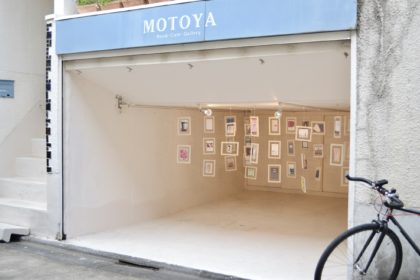
    MOTOYA Book Cafe Gallery at the “Book Lovers” venue.
    Before entering the venue, seeing this garage setting will make me feel good.
    『Book Lovers』会場のMOTOYA Book Cafe Gallery 。
    会場に入る前、このガレージの様子を見て気分が昂まります。

    It’s April.
    I have been staying in Tokyo since late March.
    After moving to Tokyo, I started by going to
    the book art exhibition “Book Lovers” that I am exhibiting.

    4月になってしまいました。
    3月下旬から東京に滞在しています。
    上京して、まずは出品しているブックアート展「Book Lovers」を
    訪ねることからスタートです。

    The appearance of MOTOYA Book Cafe Gallery.
    MOTOYA Book Cafe Galleryの外観。

    MOTOYA Book Cafe Gallery is a book cafe gallery located
    in a quiet residential area of ​​Shibuya-ku, Tokyo.
    It’s a bookstore, a cafe, a gallery, and sometimes workshops.
    There was also a fairly specialized bookbinding workshop,
    which made me very eager to learn.

    MOTOYA Book Cafe Gallery は東京都渋谷区の閑静な住宅街にある
    ブックカフェギャラリーです。
    本屋であり、カフェであり、ギャラリーで、時にはワークショップも催されています。
    かなり専門的な製本のワークショップもあり、受講したくてうずうずしました。

    entrance.
    A wooden door painted in blue gray, which is the color of the shop
    入口。
    お店の色である、ブルーグレーに塗られた木のドア。

    Exhibitions and advanced workshops are held by the owner, but
    There is no formal atmosphere at all.
    The owner, Motoya, wanted the customer to spend his time as if he were at home,
    so she chose a house and renovated it into a book cafe.

    オーナーによって内容を吟味した展示や、 高度なワークショップが開催されていますが、堅苦しい雰囲気は全くありません。 家にいるような気分で時間をすごしてもらいたい、という思いから、 オーナーのモトヤさんは一軒家の住宅を選んで店舗に改装されたのだそうです。

    Of course, books were lined up in the store.
    There are many foreign books on art.
    もちろん店内には本が並んでいました。
    美術系の洋書が多く見られます。
    One of the exhibiting artists is reading the book.
    I was happy to get permission to shoot.
    本を読んであるのは出展作家のお一人。
    快く撮影許可をいただきました。

    It is a state of the exhibition of “Book Lovers”.
    This day was the last day, and many exhibiting artists were in the hall.
    At this exhibition, you can pick up and read all the works.
    You can even touch works that are not for sale.
    The book is read.
    The page is turned.

    『Book Lovers』の展示の様子です。
    この日は最終日とあって、たくさんの出展作家が在廊していました。
    この展示会では全作品を手に取って読むことができます。
    非売品の作品でさえ、実際に触れることができるのです。
    本は読むもの。
    ページはめくるもの。

    Shop cards and DM are placed.
    The windows are frosted glass.
    It’s bright and you can see the flowers, but the line of sight from the outside is blocked.
    I feel the owner’s awareness so that the customers can concentrate and enjoy the work.
    ショップカード、DMコーナー。
    窓は曇りガラス。
    明るくて、お花も見えるのに、外からの視線は程よく遮ってくれる安心感。
    集中して作品を楽しめるためのオーナーさんの気づかいを感じます。

    This “Book Lovers” was held for the 6th time this year.
    Some of you have been attending this event for many years
    and have a long history of bookbinding,
    and I asked them a lot of questions about bookbinding.
    Motoya and everyone else kindly answered.
    Thank you very much.

    『Book Lovers』は今年で6回目の開催ということでした。
    このイベントに長年参加されている方や、製本歴の長い方もいらっしゃって、
    製本に関する質問をあれやこれやとしてしまいました。
    モトヤさんをはじめ、皆さんとっても親切に答えてくださる方ばかりでした。
    なんともありがたい。

    Signboard of “Book Lovers”.
    『Book Lovers』の看板。

    It was a Book exhibition that I would like to participate in again with a new work.
    This is a book cafe and gallery with many book-related projects,
    so I’m looking forward to it as a viewer.

    新作を携えてまた参加したいBook展でした。
    本に関する企画の多いブックカフェ・ギャラリーなので、見に伺うのも楽しみです。

    Herb cordial with soda.
    It was very delicious in my throat as I walked around.
    ハーブコーディアルの炭酸割り。
    歩き回った喉にとても美味しかった。
  • Book Lovers

    Book Lovers

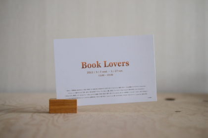
    I received a DM from the organizer.
    It is distributed to acquaintances in Fukuoka who are engaged in creative activities.
    Contact me if you want.
    主催者からDMが届きました。
    創作活動をしている福岡の知り合いに配っています。
    欲しい方は私に連絡を、ぜひ。

    I entered my work in an exhibition.
    The is exhibition called “Book Lovers”, which is an exhibition of book art.
    It will be held at MOTOYA Book Cafe Gallery in Tokyo.
    It will be held from March 2nd to March 27th.
    You can also see the work online during the period.
    There are many authors other than me, so you should be able to enjoy it.
    If you can, go to the gallery, if you’re far away, go to the website, and if you’re creating, join us next time.

    展示会に出品しています。
    それは ” Book Lovers ” というブックアートの展覧会です。
    東京にあるMOTOYA Book Cafe Galleryにて開催されます。
    開催期間は、3月2日−3月27日。
    会期中はオンラインで作品を見ることができます。
    私以外の作者がたくさん出品されているようですし、きっと楽しめるはずです。
    可能な方は会場へ、遠方の方はwebサイトへ、
    そして、もし、創作活動をしているのならば、次回はぜひ参加を!

    This time, I exhibited “Koi” .
    Photo : tsubottlee
    Design,DTP : creative works Grouper

    今回、”孤悲”を出品しています。
    写真:tsubottlee
    デザイン,DTP:creative works Grouper


    I had released it 2019 may.
    However, there was an undisclosed special binding version.
    It’s a hardcover binding.
    This work needs paper knife to read.
    I had a craftsman make a bamboo paper knife for this book.
    It has the shape of a drop that can be used with both hands.
    This design also has meaning.

    2019年5月に公開した作品ですが、未公開の特別装丁版を出しています。
    これはハードカバー製本になります。
    読むにはペーパーナイフが必要で、
    この作品のために竹細工職人に作ってもらいました。
    両手利き用の雫型のデザインです。
    このデザインにも意味を込めています。

    Title is printed by silk-screen same as softcover binding.
    Letters are intentionally blurred.
    タイトルはソフトカバー製本と同じくシルクスクリーン印刷です。
    文字はわざと滲ませてあります。

    The end paper was colored to match the photo.
    見返しは写真にあわせて色付けしています。

    Handmade paper for this book.
    Before the paper dries, it drops water and marks it.
    この本のために漉いてもらった特別な手漉き和紙。
    落水紙といって、漉きたての紙に水を落とし痕をつけてもらいました。

    The three end papers are Yame handmade Japanese paper.
    These also match the colors in the photo.
    It’s a very thin paper, and it’s a light color that you can see compared to white.
    見返し紙3枚とも八女手漉き和紙です。
    これも写真と色をあわせました。
    とても薄い紙で、色も白と比べてわかるくらい淡いです。

    This book is uncut.
    You will need a paper knife here.
    I planned to make a work using this structure.
    この本はアンカットです。
    ここでペーパーナイフ登場。
    アンカットを生かした本が作りたくて企画した作品です。

    Double section.
    The keyword of this work is “2”.
    ダブルセクション。
    この作品のキーワードは”2”。

    The font used is Tsukushi typeface.
    I adopted the suggestion from the designer.
    This is a font that is particular about non-uniform Japanese shapes and spacing.
    And the point of this work is the emotions that attract each other.
    I imagine a relationship where the one and only two people fit perfectly.
    使用フォントは筑紫書体。
    デザイナーからの提案を採用しました。
    これは均一ではない日本語の形とスペーシングにこだわったフォントです。
    そして、この作品は二人の惹きあう感情がポイントです。
    唯一無二の二人がぴたりと嵌る関係をイメージしています。

    I use Japanese and English.
    Not a complete translation.
    Japanese and English have an auxiliary relationship.
    The layout of the letters also makes sense.
    日本語と英語を使って表現しています。
    完全な翻訳ではなく、双方が補助になっている部分があります。
    文字のレイアウトにも意味を持たせています。

    Strangely, it was exhibited in a work exhibition called Lovers.
    ” Love is a yearning to be one ”
    Ancient Greek philosopher Plato’s words.
    奇しくも、Loversという展示への出品です。
    ”愛とは一つになりたいという願いである”
    古代ギリシャの哲学者プラトンは愛をそう説きました。

    The second keyword is tears and drops.
    It expresses the sadness that two people who are attracted to each other cannot become one.
    They are just two people, and because they are two people, they can attract each other.
    Drops are tears of joy in finding a one-of-a-kind partner, love to pour, and tears of sadness that cannot be one.
    二つ目のキーワードは”涙” ”雫”。
    惹かれあう二人の一つになることができない切なさ。
    二人はあくまでも二人であり、二人であるから惹きあうことができるという事実。
    雫は、唯一無二の相手を見つけた喜びの涙であり、注ぐ愛情であり、一つになれない悲しみの涙です。

    Enjoy our love for books.
    本への恋をお楽しみください。

  • Book cover design

    Book cover design

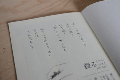
    What is a book ?
    Spell the letter.
    Binding paper.
    It will be in the form of a book.
    The book we are looking for.
    What kind of book is it ?

    The text in the frontispiece of “Tsuduru”‘s first issue.
    Fontworks‘s Kafu pen-style font is used.
    The word “tsuduru” has both meanings of writing sentences in a row and sewing paper for binding.
    It’s a word for making books.
    That is the origin of my shop name and the name of my publication.
    The design and DTP is creative works Grouper ( Yoko Futagami ) .

    『綴る』vol.1の口絵に載せた文章。
    使用フォントはフォントワークス花風ペン字体
    「綴る」という言葉には、文章を書き連ねる、紙を縫いあわせて本にするという両方の意味があります。
    まるで本づくりのためにあるような言葉。
    それが私の屋号の由来でもあり、出版物の名前にもなっています。
    デザイン・DTPは creative works Grouper ( フタガミ ヨーコ氏 )

    I wonder.
    Why do people want visual elements?
    Long before the word Mingei was born, we have been patterning earthenware.
    Not only the building, clothes and tableware, but also the serving of food is enjoyed by the eyes.
    What we are looking for is not only beauty, but also various kinds of pleasures such as coolness, cuteness, relaxation, and stimulation.
    In other words, we need more than just usability.

    不思議だ。
    人はなぜ見た目にこだわるんだろう。
    民藝という言葉が生まれるずっと前から、私たちは土器に模様をつけたりしてきました。
    建物や、衣服、食器はもちろん、料理の盛りつけも目で楽しんでいますよね。
    そこに求めているのは美しさだけでなく、格好良さ、可愛さ、寛ぎ、刺激、という様々な種類の快楽。
    つまり、私たちには使い勝手以外の要素も必要だということ。


    In my last blog, I mainly talked about concept setting and didn’t talk much about design.
    This time I would like to talk about the visual issue, design.

    前回のブログでは、コンセプト設定の話が主でデザインについてはあまり触れませんでした。
    今回は、視覚的な問題、つまりデザインについて話していきたいと思います。

    The first self-funded publication “Tsuduru”
    The design and DTP by creative works Grouper ( Yoko Futagami ) .
    Calligraphy by Satsuki Hatsushima.
    自費出版の第一号『綴る』。
    デザインとDTPは creative works Grouper ( フタガミ ヨーコ氏 ) によるもの。
    カリグラフィーは初島さつき氏。

    “Tsuduru” is a booklet that I edit and publish.
    I started making it for the purpose of popularizing a project that triggered the bookbinding.
    But when it comes to creating, “what is a book?” I was faced with the question.
    I can’t make it without answering this question.
    So I decided to put that question into shape.
    Since then, I have been publishing with the attitude of making books that I really want to make.

    『綴る』は私が編集、出版している小冊子です。
    製本をするきっかけとなったプロジェクトの普及を目的として作りはじめました。
    しかし、いざ作りだすと、「本って何?」という問いにぶつかったのです。
    この問いを解かずに製作することは私にはできません。
    そこで、その問いをそのまま形にすることにしました。
    以後、本当に作りたい本を作るという姿勢で発行しています。

    The first three book designs from Yoko Futagami.
    An image of calligraphy in the pink colored part.
    フタガミヨーコ氏からの最初の表紙デザイン3案。
    ピンクに色付けされた部分にカリグラフィーが入るイメージ。

    The cover of Volume 1 of “Tsuduru” expresses the etymology of the Chinese character 綴.
    The basic meaning is to connect disjointed things together.
    That is design A.
    It is the Chinese character of the radical that represents the thread.
    So, it has a special meaning of connecting with a thread.
    Plan B is a design that expresses the meaning of connecting with threads.
    In addition, the sound of Tsuduru’s “Tsudu” has the same roots as the Tsuduku’s( following , continue ) “Tsudu”.
    Both are words that describe disjointed things stick together and do not separate.
    From that meaning, design C represents the everyday life that continues.

    『綴る』vol.1の表紙は漢字の綴という文字の語源を表現したものです。
    ばらばらのものを繋ぎあわせるというのが、その基本の意味になります。
    それがデザインA案。
    綴は部首が糸偏の漢字です。
    ですから、特に糸を使ってつなげるという意味もあります。
    糸で繋げるという意味を表現したのがデザインB案。
    また、綴るの「つづ」という音は、続くの「つづ」と同根の意味を持っています。
    どちらもばらばらのものがくっついて離れない様子を表した言葉なのです。
    その意味から、デザインC案は続いていく日常を表しています。

    All three were designed to express the etymology.
    But, all three have completely different designs.
    When you find something that suits your heart, it’s easy to decide.
    I chose design A at a glance.
    The first edition was 2017.
    I thought it was great at the time,
    but now that 2021 is nearing the end,
    I can finally talk about design.
    And I still fall in love with this design.

    3つ全てが語源を表現したデザインです。
    しかし、3つとも全く違うデザインなのです。
    心に叶うものが見つかった時というのは、一瞬で決まるもの。
    私は一目でデザインAを選びました。
    初版が2017年。
    当時も素晴らしいと思っていましたが、
    2021年も終わりかけの今になって、
    ようやくデザインについて話せるようになりました。
    そして、今でもこのデザインに惚れ惚れとします。

    There were two conditions in the design of this book.
    One is to use handwritten calligraphy (not printing).
    The second is Japanese binding.
    The text inside is written vertically, so it is a book design with right binding.
    The binding thread pattern of the bookbinding is also considered as part of the design.
    Matching the content, binding, and design is also an issue of “Tsudurru”.

    この本のデザインは2つの条件がありました。
    1つは手書きのカリグラフィーを使うこと(印刷ではなく)。
    2つめは和綴じ製本することでした。
    中の文章は縦書きなので、右綴じのデザインになります。
    製本の綴じ糸の模様までデザインの一部と考えてあります。
    内容と製本とデザインの一致、それも『綴る』の課題です。

    Encounter with Yoko Futagami from this book.
    From planning to publishing, she made zine “Irohani”.
    フタガミヨーコ氏と出会うきっかけになった一冊。
    企画から出版まで彼女が作ったniche na zine 『いろはに』。

    I was looking for a designer to make a booklet for the purpose of popularizing a project.
    I found her zine in my favorite bookstore.
    The name of the bookstore is taramu books & cafe.
    It’s a good bookstore, so I recommend checking it out.
    The owner introduced her to me.
    First of all, I was attracted to the design of the cover of this zine.
    A title logo that is not an existing font.
    Block pattern of watercolors.
    I felt that the color and the atmosphere of the typeface were in harmony.

    あるプロジェクトの普及目的のために冊子を作ろうとデザイナーを探していました。
    そんな時、行きつけの本屋で彼女のzineを見つけたのです。
    本屋の名前はtaramu books&cafe
    とても良い本屋なのでチェックをお勧めします。
    そこのオーナーが彼女を私に紹介してくれたのですから。
    まず、このzineの表紙デザインに惹かれました。
    既存のフォントではないタイトルロゴ。
    水彩絵の具のブロック模様。
    色と書体の雰囲気の調和が好ましいと感じました。

    “Irohani” frontispiece.
    The content is also very good.
    『いろはに』の口絵。
    表紙デザインはさることながら、内容もとても良かったのです。

    The content of “Irohani” consisted mainly of interviews with local radio stations and electric companies.
    This issue is in the winter of 2016.
    It was the year when the electricity retail market was completely liberalized in Japan.
    And the opening of radio stations in this area is also in 2016.
    She interviewed herself about current affairs at the time and wrote an article carefully.
    The project I planned was aimed at supporting the reconstruction of the Kumamoto earthquake,
    so I asked her to interview the project.
    I thought her zine was good for making the project widely known.
    But unfortunately, this zine was the final volume.
    So, it was “Tsuduru” that she and I started together.

    『いろはに』は地元のラジオ局、電気会社への取材をメインに構成されていました。
    発行は2016年の冬。
    これは、日本で電力小売完全自由化された年。
    そして、この地域のラジオ局の開設も同じく2016年。
    当時の時事問題について、彼女は自ら取材をし丁寧に記事にしていました。
    私が企画したプロジェクトは熊本地震復興支援が目的だったので、
    彼女に取材をお願いしました。
    プロジェクトを広めるためには、彼女のzineが良いと感じたからです。
    しかし残念なことに、このzineは最終刊でした。
    そこで彼女と私の二人で始めたのが『綴る』です。

    Advertisement for Kumamoto earthquake reconstruction support project,
    Nishiharamura fusuma arts & crafts project.
    This is described in Volume 1 of “Tsuduru”.
    Yoko Futagami is redesigning the advertisement I was making.
    Easy to read and well-balanced.
    This kind of sensibility is the ability of people who work in design.
    熊本地震復興支援プロジェクト、西原村ふすまアート&クラフト プロジェクトの広告。
    これは『綴る』vol.1に載せています。
    私が作っていたものを、フタガミヨーコ氏がデザインしなおしてくれました。
    それにより、読みやすく、バランスも整いました。
    こういった感性が、デザインを生業にしている人の能力だと思います。

    In the final issue of “Irohani,” Yoko Futagami wrote an article about
    what she was really interested in and designed it as she wanted.
    The medium of zine clearly expresses the person who created it.
    I fell in love with the design and content.
    This is probably because our philosophies and sensibilities are in agreement with each other.
    Therefore, the communication in the production of “Tsuduru” was very good.
    Next time, I would like to talk about a typesetting.


    『いろはに』最終刊で、フタガミヨーコ氏は本当に興味のあることを記事にし、
    思いどおりにデザインをしたと言います。
    zineという媒体は、制作者の人となりがはっきりと打ち出されています。
    私はそのデザインと内容に心惹かれたわけです。
    お互いの理念や感性が一致しているからでしょう。
    そのため『綴る』制作での意思疎通はとてもスムーズに進んだのです。
    次回、本文の文字組みについて話したいと思っています。