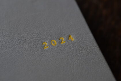
Book cover design
Spell the letter.
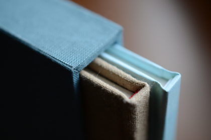
Binding paper.
It will be in the form of a book.
The book we are looking for.
What kind of book is it ?
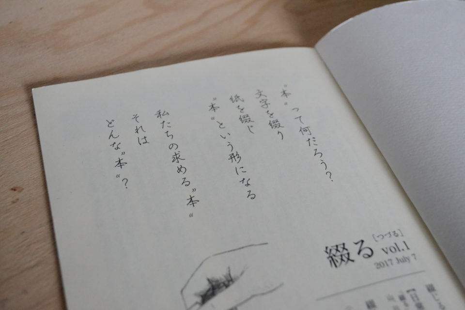
The text in the frontispiece of “Tsuduru”‘s first issue.
Fontworks‘s Kafu pen-style font is used.
The word “tsuduru” has both meanings of writing sentences in a row and sewing paper for binding.
It’s a word for making books.
That is the origin of my shop name and the name of my publication.
The design and DTP is creative works Grouper ( Yoko Futagami ) .
『綴る』vol.1の口絵に載せた文章。
使用フォントはフォントワークスの花風ペン字体。
「綴る」という言葉には、文章を書き連ねる、紙を縫いあわせて本にするという両方の意味があります。
まるで本づくりのためにあるような言葉。
それが私の屋号の由来でもあり、出版物の名前にもなっています。
デザイン・DTPは creative works Grouper ( フタガミ ヨーコ氏 ) 。
I wonder.
Why do people want visual elements?
Long before the word Mingei was born, we have been patterning earthenware.
Not only the building, clothes and tableware, but also the serving of food is enjoyed by the eyes.
What we are looking for is not only beauty, but also various kinds of pleasures such as coolness, cuteness, relaxation, and stimulation.
In other words, we need more than just usability.
不思議だ。
人はなぜ見た目にこだわるんだろう。
民藝という言葉が生まれるずっと前から、私たちは土器に模様をつけたりしてきました。
建物や、衣服、食器はもちろん、料理の盛りつけも目で楽しんでいますよね。
そこに求めているのは美しさだけでなく、格好良さ、可愛さ、寛ぎ、刺激、という様々な種類の快楽。
つまり、私たちには使い勝手以外の要素も必要だということ。
In my last blog, I mainly talked about concept setting and didn’t talk much about design.
This time I would like to talk about the visual issue, design.
前回のブログでは、コンセプト設定の話が主でデザインについてはあまり触れませんでした。
今回は、視覚的な問題、つまりデザインについて話していきたいと思います。
The design and DTP by creative works Grouper ( Yoko Futagami ) .
Calligraphy by Satsuki Hatsushima.
自費出版の第一号『綴る』。
デザインとDTPは creative works Grouper ( フタガミ ヨーコ氏 ) によるもの。
カリグラフィーは初島さつき氏。
“Tsuduru” is a booklet that I edit and publish.
I started making it for the purpose of popularizing a project that triggered the bookbinding.
But when it comes to creating, “what is a book?” I was faced with the question.
I can’t make it without answering this question.
So I decided to put that question into shape.
Since then, I have been publishing with the attitude of making books that I really want to make.
『綴る』は私が編集、出版している小冊子です。
製本をするきっかけとなったプロジェクトの普及を目的として作りはじめました。
しかし、いざ作りだすと、「本って何?」という問いにぶつかったのです。
この問いを解かずに製作することは私にはできません。
そこで、その問いをそのまま形にすることにしました。
以後、本当に作りたい本を作るという姿勢で発行しています。
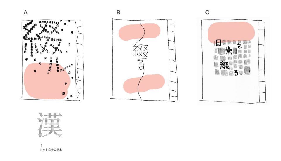
An image of calligraphy in the pink colored part.
フタガミヨーコ氏からの最初の表紙デザイン3案。
ピンクに色付けされた部分にカリグラフィーが入るイメージ。
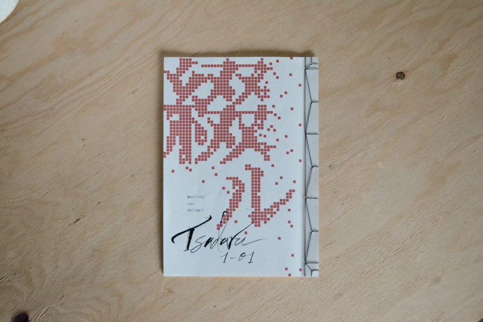
The cover of Volume 1 of “Tsuduru” expresses the etymology of the Chinese character 綴.
The basic meaning is to connect disjointed things together.
That is design A.
It is the Chinese character of the radical that represents the thread.
So, it has a special meaning of connecting with a thread.
Plan B is a design that expresses the meaning of connecting with threads.
In addition, the sound of Tsuduru’s “Tsudu” has the same roots as the Tsuduku’s( following , continue ) “Tsudu”.
Both are words that describe disjointed things stick together and do not separate.
From that meaning, design C represents the everyday life that continues.
『綴る』vol.1の表紙は漢字の綴という文字の語源を表現したものです。
ばらばらのものを繋ぎあわせるというのが、その基本の意味になります。
それがデザインA案。
綴は部首が糸偏の漢字です。
ですから、特に糸を使ってつなげるという意味もあります。
糸で繋げるという意味を表現したのがデザインB案。
また、綴るの「つづ」という音は、続くの「つづ」と同根の意味を持っています。
どちらもばらばらのものがくっついて離れない様子を表した言葉なのです。
その意味から、デザインC案は続いていく日常を表しています。
All three were designed to express the etymology.
But, all three have completely different designs.
When you find something that suits your heart, it’s easy to decide.
I chose design A at a glance.
The first edition was 2017.
I thought it was great at the time,
but now that 2021 is nearing the end,
I can finally talk about design.
And I still fall in love with this design.
3つ全てが語源を表現したデザインです。
しかし、3つとも全く違うデザインなのです。
心に叶うものが見つかった時というのは、一瞬で決まるもの。
私は一目でデザインAを選びました。
初版が2017年。
当時も素晴らしいと思っていましたが、
2021年も終わりかけの今になって、
ようやくデザインについて話せるようになりました。
そして、今でもこのデザインに惚れ惚れとします。
There were two conditions in the design of this book.
One is to use handwritten calligraphy (not printing).
The second is Japanese binding.
The text inside is written vertically, so it is a book design with right binding.
The binding thread pattern of the bookbinding is also considered as part of the design.
Matching the content, binding, and design is also an issue of “Tsudurru”.
この本のデザインは2つの条件がありました。
1つは手書きのカリグラフィーを使うこと(印刷ではなく)。
2つめは和綴じ製本することでした。
中の文章は縦書きなので、右綴じのデザインになります。
製本の綴じ糸の模様までデザインの一部と考えてあります。
内容と製本とデザインの一致、それも『綴る』の課題です。
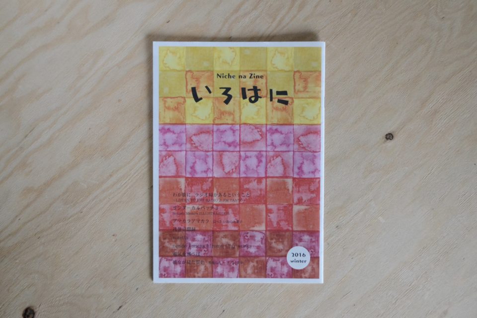
From planning to publishing, she made zine “Irohani”.
フタガミヨーコ氏と出会うきっかけになった一冊。
企画から出版まで彼女が作ったniche na zine 『いろはに』。
I was looking for a designer to make a booklet for the purpose of popularizing a project.
I found her zine in my favorite bookstore.
The name of the bookstore is taramu books & cafe.
It’s a good bookstore, so I recommend checking it out.
The owner introduced her to me.
First of all, I was attracted to the design of the cover of this zine.
A title logo that is not an existing font.
Block pattern of watercolors.
I felt that the color and the atmosphere of the typeface were in harmony.
あるプロジェクトの普及目的のために冊子を作ろうとデザイナーを探していました。
そんな時、行きつけの本屋で彼女のzineを見つけたのです。
本屋の名前はtaramu books&cafe 。
とても良い本屋なのでチェックをお勧めします。
そこのオーナーが彼女を私に紹介してくれたのですから。
まず、このzineの表紙デザインに惹かれました。
既存のフォントではないタイトルロゴ。
水彩絵の具のブロック模様。
色と書体の雰囲気の調和が好ましいと感じました。
The content is also very good.
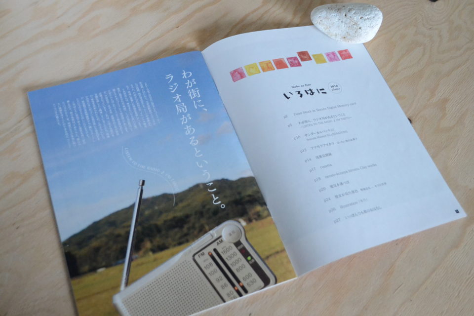
『いろはに』の口絵。
表紙デザインはさることながら、内容もとても良かったのです。
The content of “Irohani” consisted mainly of interviews with local radio stations and electric companies.
This issue is in the winter of 2016.
It was the year when the electricity retail market was completely liberalized in Japan.
And the opening of radio stations in this area is also in 2016.
She interviewed herself about current affairs at the time and wrote an article carefully.
The project I planned was aimed at supporting the reconstruction of the Kumamoto earthquake,
so I asked her to interview the project.
I thought her zine was good for making the project widely known.
But unfortunately, this zine was the final volume.
So, it was “Tsuduru” that she and I started together.
『いろはに』は地元のラジオ局、電気会社への取材をメインに構成されていました。
発行は2016年の冬。
これは、日本で電力小売完全自由化された年。
そして、この地域のラジオ局の開設も同じく2016年。
当時の時事問題について、彼女は自ら取材をし丁寧に記事にしていました。
私が企画したプロジェクトは熊本地震復興支援が目的だったので、
彼女に取材をお願いしました。
プロジェクトを広めるためには、彼女のzineが良いと感じたからです。
しかし残念なことに、このzineは最終刊でした。
そこで彼女と私の二人で始めたのが『綴る』です。
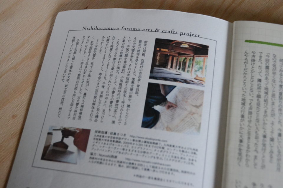
Nishiharamura fusuma arts & crafts project.
This is described in Volume 1 of “Tsuduru”.
Yoko Futagami is redesigning the advertisement I was making.
Easy to read and well-balanced.
This kind of sensibility is the ability of people who work in design.
熊本地震復興支援プロジェクト、西原村ふすまアート&クラフト プロジェクトの広告。
これは『綴る』vol.1に載せています。
私が作っていたものを、フタガミヨーコ氏がデザインしなおしてくれました。
それにより、読みやすく、バランスも整いました。
こういった感性が、デザインを生業にしている人の能力だと思います。
In the final issue of “Irohani,” Yoko Futagami wrote an article about
what she was really interested in and designed it as she wanted.
The medium of zine clearly expresses the person who created it.
I fell in love with the design and content.
This is probably because our philosophies and sensibilities are in agreement with each other.
Therefore, the communication in the production of “Tsuduru” was very good.
Next time, I would like to talk about a typesetting.
『いろはに』最終刊で、フタガミヨーコ氏は本当に興味のあることを記事にし、
思いどおりにデザインをしたと言います。
zineという媒体は、制作者の人となりがはっきりと打ち出されています。
私はそのデザインと内容に心惹かれたわけです。
お互いの理念や感性が一致しているからでしょう。
そのため『綴る』制作での意思疎通はとてもスムーズに進んだのです。
次回、本文の文字組みについて話したいと思っています。