カテゴリー: archive

  • Event concept and ad design  ーinvisible things were taking shapeー

    Event concept and ad design ーinvisible things were taking shapeー

    The morning of the second day of the event.
    イベント2日目の朝。

    I haven’t blogged for a while.
    Because I managed the event and my bookbinding.
    The events name is Tsunagu marché.
    The event beginning was made by Craft tsunagu owner.
    she runs a craft store named Tunagu, she called out four of us.
    The first event holed last year December.
    At that time, we were restricted our actions.
    We only wanted a place to the action.


    しばらくブログが滞っていました。
    イベントの運営と製本をしておりました。
    そのイベントの名前はツナグマルシェ
    クラフトつなぐ店主がイベントのきっかけです。
    つなぐという名前の工芸品店を営んでおり、
    私たちメンバー4名への声かけが事の発端。
    1回目は昨年の12月に開催しました。
    当時、私たちは活動を制限されており、
    ただただ活動の場が欲しい一心でした。

    This is my booth at first event.
    I prepared a lot of Christmas cards of calligraphy for season.
    My calligraphy friend helped me.
    She wrote many cards for me.
    I just wanted show many people calligraphy.
    However, I couldn’t write a calligraphy card because I was busy binding.
    最初のイベントの時の私のブースの様子。
    季節に合わせてカリグラフィーのクリスマスカードをたくさん用意しました。
    これらはカリグラフィー仲間の力によるもの。
    私のためにたくさんのカードを書いてくれたのです。
    手書きアルファベットを知ってもらおうと考えてはいましたが、
    私は製本だけで精一杯、とてもカリグラフィーカードまで書く余裕がありませんでした。

    Tsunagu means connecting what is separated.
    She named her shop Tsunagu.
    Because she wanted be connector to maker and user.
    And she connected us by this event.
    The frist Tsunagu marché had no time until hold.
    Anyway, let’s do it !!
    So we challenged.
    That time, I one more challenged.
    It’s flier design.


    つなぐとは分かれているものを結びつけるという意味。
    彼女は自分の店をつなぐと名付けたのは、
    作り手と使い手を繋げるお店にしたかったからだと言います。
    そして、このイベントで彼女は私たちを繋げました。
    最初のツナグマルシェは開催までに時間がなく、
    とにかくやってみよう!!と、私たちは挑戦したのです。
    この時、私はもう一つの挑戦をしました。
    それがフライヤーデザインです。

    The first Tsunagu marché flier. The front.
    I used an application called Affinity Publisher.
    1回目のツナグマルシェフライヤー。表。
    使用したのはAffinityのPublisherというアプリケーションです。
    This is the back.
    こちらは裏面。

    Then, I will want to tell you why I had challenged flier design.
    Because, I started making books and had more opportunities to work with designers.
    I have an ambition to use calligraphy in my designs.
    Before that, I didn’t know if the design was good or bad…
    To do that, I first needed to know the design.
    Opportunity came around there.
    I got chance design Tsunagu marché flier.
    Designing a flier has taught me a lot.
    This is the record.


    では、なぜ私がフライヤーデザインをやってみようと思ったのか。
    本を作るようになり、デザイナーと仕事をする機会が増えました。
    デザインの中にカリグラフィーを取り入れたいのですが、
    それ以前の問題として、私にはデザインの良し悪しが判らず。。。
    そのためには、まずデザインについて知ることが必要だと考えました。
    そこにツナグマルシェのフライヤーデザインというチャンスが回ってきたのです。
    私はフライヤーデザインから多くのことを学びました。
    これはその記録。


    For we perceived a definite reaction from the first event, we decided held second event.
    And, I also designed second event flier.

    私たちは初回のイベントにたしかな手応えを感じたことから、
    2回目のイベント開催を決めました。
    そして、2回目のイベントフライヤーのデザイン担当も私です。

    Tsunagu marché second flier. The front.
    ツナグマルシェ2回目のフライヤー。表。
    This is the back.
    その裏面。

    Did I grow up by comparing the two.
    The first flier design helped me with the good photos taken by the members.
    If we use the work of the same member as the last time for this event image,
    we can’t use it because it seems to be the event of that maker.
    For that reason, the second flier design needed a photo shoot.
    What is needed here is image shooting.
    At this time, I learned that there are two types of advertising photos,
    image photos and product photos.
    (The story will be off, so I’ll talk about photos next time)
    Even if we ask a cameraman, we have to clarify the image of the event.
    No, shooting is also necessary, but styling is also necessary.
    I finally realized that everything was underpowered.

    二つを見比べてみて、私は成長できたのか。
    最初のフライヤーは、メンバー撮影の雰囲気の良い写真頼みのデザインでした。
    今回のイベントイメージに前回と同じメンバーの作品を使うことはできません。
    それは、その作家主催のイベントに思われてしまうかもしれないからです。
    この理由から、2回目のイベントフライヤーデザインでは写真撮影が必要になりました。
    必要になってくるのがイメージ撮影です。
    この時になって、広告写真にはイメージ写真と商品写真の二種類があると、私は知るのです。
    (脱線してしまうので、写真の話はまた次回に)
    仮にカメラマンに撮影依頼するとしても、
    主催するイベントのイメージは明確にしておかなくてはなりません。
    いや、撮影もですが、スタイリングだって必要です。
    何もかもが力不足であることに、やっと私は気づきました。

    Cafe Nagykovácsi cookies.
    The black band on this wrap is the basis of the design.
    Nagykovácsi is a small town in Hungary.
    It is also a wonderful communication to ask the owner about the origin of the store name.
    カフェ ナギコバスキのクッキー。
    包装の黒い帯がデザインの素になりました。
    ナギコバスキはハンガリーの小さな町の名前です。
    店名の由来を店主に聞くのも素敵なコミュニケーション。

    Now, I have no choice but to do my best !!
    All we have to do is clarify and share the event image.
    Tsunagu marché is a joint management of five members.
    Actually, the first meeting with each other was at the time of the first event.
    Only Craft Tsunagu knew everyone.
    We had to spend a lot of time in a meeting to put together the opinions of the five people.

    さぁ、こうなるともう頑張るしかない!
    やるべきことは、イベントイメージを固めて、共有することですよね。
    ツナグマルシェは5名のメンバーによる共同運営です。
    実は、初回のイベントが初顔合わせのメンバーばかりだったのです。
    クラフトつなぐだけが全員と顔見知りという状態。
    5名の意見をまとめるために、私たちはたくさんの時間を費やしました。

    Jiji printing of silk screen printing shop.
    I went to see how the members are opening stores.
    The signboard is an antique clay tablet.
    It is painted with Kakishibu and printed on silk screen.
    シルクスクリーンの小さな印刷屋、jiji printing
    メンバーの出店の様子を見に行きました。
    看板は骨董の粘土板だそう。
    柿渋を塗り、シルクスクリーンで印刷してあります。

    I would like to record how I faced the concept.
    The concept, which is also important in making works.
    The first, reconsidered the concept of the event.
    If the event get continue, needs reliable concept.
    Assuming that the event will continue as the members change,
    I wanted to decide on a concept that would not change easily and would apply to many people.

    どのようにコンセプトと向き合ったのかを記録しておきたいと思います。
    コンセプト、それは作品作りにおいてもとても重要なものです。
    まずは、イベントのコンセプトを洗いなおすことから始めました。
    もし、このイベントが継続していくのなら、しっかりとしたコンセプトが必要になります。
    メンバーが入れ替わりながらイベントが続いていくことを想定し、
    簡単には変わらない、多くの人に当てはまるものにすることを決めたわけです。

    I also went to the riverbank looking for a place to shoot.
    A glass of Crafts Tsunagu.
    Blown glass was what inspired her to open the store.
    撮影場所を探しに河原へ出かけたり。
    これはクラフトつなぐのグラス。
    吹きガラスがお店をひらくきっかけになった工芸品。

    The reason why the members change is related to our lifestyle.
    There are tasks in life that should be prioritized over our own activities,
    such as childbirth, childcare and long-term care.
    Some of them may be working while working for a company.
    They are very important, and what you want to do is also very important.

    なぜメンバーが入れ替わるのか、それは私たちの生活スタイルが関わっています。
    出産、育児、介護など、自分の活動より優先すべきタスクが人生にはあります。
    中には会社勤めをしながら活動している人もいることでしょう。
    それらだってとても重要なことで、自分自身のやりたいこともとても重要です。

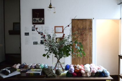
    Members gathered with the keyword of handicrafts.
    Bon Voyage hand dyed yarn.
    Ayutthaya, my favorite color yarn.
    She does not sell knitted products, but dyed yarn.
    手仕事を鍵に声をかけられたメンバーたち。
    手染め毛糸作家 Bon Voyage hand dyed yarn.
    アユタヤという私の好きな色の毛糸。
    編んだ製品を販売しているのではなく、染めた毛糸を販売しています。

    Wouldn’t it be happy if you could find something worthwhile in a life without a fixed purpose?
    We wanted to keep up with what we finally found and wanted to do.
    For example, you can’t participate this time, but you can participate in the next event,
    or you can enjoy yourself as a customer even if you can’t open the next store.
    I wish I had a place to regain my original self.
    Isn’t everyone looking for a place of activity ?
    Just as we were looking for a place of activity as Tsunagu marché beginning.
    Then, I decided on the concept of connecting with my true self.

    定められた目的のない人生において、やりがいを見つけられたのなら幸せだと思いませんか?
    私たちがやっと見つけたやりたいことを、手放さずに済むようにしたかったのです。
    例えば、今回は参加できないけれど、次回は参加できたり、
    次回は出店できないけれど、お客さんとして楽しむことができたり。
    本来の自分を取り戻す場があれば、と。
    みんなも求めているのではないでしょうか?
    このツナグマルシェの始まりに、私たちが活動の場を求めていたように。
    そうして「本当の自分とつながる」をコンセプトに決めたのです。

    It’ me.
    Not all handicrafts were good.
    I searched for something in common so that I could respect each individuality.
    What kind of handicraft event is it? That is the character.
    これは私。
    手仕事であればなんでもよかったわけではありません。
    それぞれの個性を尊重できるように、共通するものを探しました。
    どういう手仕事のイベントなのか?という性格の部分です。

    Happily, this was accepted by other members.
    I was blessed with wonderful members and I should be grateful
    Actually, I didn’t make it based on a clear concept, but I saw it while searching for a flyer design.
    So, I think it came from all the members, not the concept I thought of alone.
    I felt that the invisible things were taking shape.
    The idea and shape are the same.
    It looks like the exact opposite, but it’s really one.
    I think this is the biggest realization I got when I was in charge of design.

    このコンセプトが他のメンバーにも受け入れてもらえたのは幸いでした。
    善きメンバーに恵まれたことに、私は感謝すべきです。
    実際には、コンセプトに基づいて作っていったのではなく、
    フライヤーデザインを模索しているうちに見えてきました。
    ですから、私一人で考えたコンセプトなのではなく、
    メンバー全員から出てきたものだと私は思っています。
    目に見えないものが形になっていくのを感じました。
    観念と形あるものが同一であるということ。
    全くの正反対に見えて、本当は一つであるということ。
    このことがデザインを担当して得た最大の気づきのように思います。

    Gallery Kashizuku at the venue.
    The owner of this gallery is a metal artist.
    She is a secret member of Tsunagu marché.
    会場のギャラリー・カシズク
    このギャラリーのオーナーは彫金作家なのです。
    ツナグマルシェの内緒のメンバー。

    It was to bring the concept of the event to design.
    I learned that a good designer has a great ability to grasp the concept.
    I thought I knew it in my head (idea),
    but the fact that it comes with a real feeling is something that
    I can experience because I have a physical body (shape).

    それはイベントコンセプトをデザインに落とし込むということ。
    このイベントを通して、優秀なデザイナーとは、
    コンセプトを把握する能力に優れているのだと強く実感しました。
    頭では理解していたつもり(観念)が実感をともなうというのは
    私が肉体(形)を持っているから経験できることですね。

  • To my dear overseas friends who love Japan.

    To my dear overseas friends who love Japan.

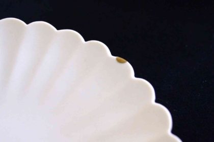
    This is Tomoko Komatsu’s kintsugi work.
    こちらは小松知子氏の金継ぎ作品。

    I started writing in English because I wanted to tell my friend’s artists about Kintsugi.
    But I am struggling to tell you.
    The material of lacquer and Kintsugi were deeper than I had imagined.
    Tomoko Komatsu and her classroom “Naosu, Tsukuru.” taught me about it.

    友人のアーティスト達に金継ぎを伝えたくて英語で書き始めました。
    しかし、伝えるのに苦心しています。
    漆という素材と金継ぎは想像以上に奥深いものだったからです。
    そのことを私に教えてくれたのが、小松知子氏であり、
    彼女が運営する金継ぎ教室「なおす、つくる。」です。

    This is also Tomoko Komatsu’s kintsugi work.
    こちらも小松知子氏の金継ぎ。

    Before talking about the Kintsugi class “Naosu, Tsukuru.”,
    I would like to tell you about the situation of my Kintsugi.
    You should get a glimpse of what Kintsugi actually does.
    Later in this blog, you’ll find sites
    where you can buy Kintsugi tools, materials, and her Kintsugi works.
    If you want it quickly, skip the first half.

    金継ぎ教室「なおす、つくる。」の話の前に
    私の金継ぎ状況をお伝えしますね。
    金継ぎとは実際にどのようなことをするのかが、
    垣間見れるかと思います。
    このブログの後半では、金継ぎの道具、材料、小松氏の金継ぎ作品を
    購入できるサイトを紹介しています。
    それが気になって待てない方は、どうぞ前半を飛ばしてくださいね。

    These two glassware are mine.
    この二つのガラス製品は私のものです。

    This is the third round of Kintsugi.
    The third time repair is the glassware.
    A thing that was split in half and a crack.
    Handmade glass and industrial glass.
    Two different properties glassware.
    The repair process and the materials used are also different.

    今度で3巡目の金継ぎです。
    3回目はガラス製品の修理を。
    真っ二つに割れた物とヒビ。
    手作りのガラスと工業製品のガラス。
    二つの性質の異なるガラス製品です。
    補修の行程も使用する材料も異なります。

    This is the first time.
    Repairing small chips.
    This is the photo the last stage.
    The left side of the three places is after polishing the finish.
    You can see that the way it shines is different from the other two places.
    Use sea bream teeth to brush.
    On the plate is the tool made by the teacher.
    Komatsu sometimes holds workshops to make tools.
    Tool making is very attractive to artists and craftsmen.

    これが初めての金継ぎ。
    小さな欠けの補修。
    最終段階の写真です。
    三箇所のうちの左側が仕上げ磨きの後。
    他の二箇所とは光り方が違うのがわかるでしょう。
    磨くのには鯛の歯を使います。
    皿の上に乗っているのが先生お手製のその道具です。
    小松氏は、道具制作のワークショップを時々開催しています。
    道具作りはアーティストや工芸家にとって非常に魅力的です。

    This is the time to finish the second round.
    It was a crack repair.
    I wanted to make the line as delicate as possible.
    So I worked very carefully.
    Repair it so that it fits in the original shape.
    However, it does not hide the scars.
    Kintsugi is designed to harmonize it.

    これは2巡目の最後です。
    ヒビの補修。
    できるだけ繊細な線にしたいと思いました。
    そのために、とても丁寧に作業をしました。
    元の形に馴染むように補修します。
    しかし、傷跡は隠しません。
    それを調和するようにデザインするのが金継ぎです。

    The introduction has become longer.
    Today, I would like to talk about the Kintsugi class I am learning “Naosu, Tsukuru”.
    “Naosu, Tsukuru” is a Japanese word that means to”repair, create.”.
    Kintsugi is newly created by repairing it.
    For that reason, owner Tomoko Komatsu says that repairs come first and creation comes later.
    And moreover here you can learn about work using lacquer other than Kintsugi.

    前置きが長くなりました。
    今日は、私が通っている金継ぎ教室「なおす、つくる」について話したいと思います。
    「なおす、つくる」とは、「補修(リペア)、(創造)クリエイト」という意味の日本語です。
    金継ぎは、なおすことで、新たにつくります。
    ですから、なおすが先、つくるが後、なのだと、オーナーの小松知子氏は言います。
    更に、ここでは金継ぎ以外の漆作品を教わることができます。

    For example this is Raden.
    It’s a decoration with shell.
    I am taking pictures of the work of other students.
    Starting with creating a design, laying the foundation and copying the design.
    Everything is delicate work.

    例えば、これは螺鈿です。
    貝を貼る装飾のことを言います。
    他の方の作業を撮らせてもらいました。
    デザインを起こすことに始まり、土台を作り、デザインを写し取ります。
    どれもこれも、細やかな作業です。

    Some of the students have a tea ceremony instructor.
    This photo shows a spoon called “Chashaku” used in the tea ceremony, which is lacquered.


    教室に通う生徒の中には茶道の師範もいらっしゃいます。
    これは茶道で使う茶杓というスプーンに漆を塗っているところ。

    This is a technique called “Makie” that draws a picture with lacquer
    and decorates it with precious metal powder.
    It is decorated on a plate for sweets in the tea ceremony.
    In this way, Komatsu’s class accepts lacquer crafts other than Kintsugi.

    これは、漆で絵を描き、貴金属の粉で装飾する蒔絵と呼ばれる技法です。
    茶道のお茶会でお菓子を盛る皿に装飾しています。
    このように、小松氏の教室では、金継ぎ以外の漆の工芸も受け入れています。

    A color sample of lacquer made by Komatsu.
    Lacquer can be used not only as an adhesive but also as a paint.
    小松氏が作っている漆の色見本。
    漆は糊料だけでなく塗料にもなります。
    These are pictures of using a special tool for lacquer crafts.
    これらは漆芸専用の道具を使っている様子の写真です。


    Moreover, I would like to introduce a company called “Taketobo” to my friends.
    There, Japanese craft products are introduced in English and sold outside Japan.
    And, Goen is a sales site operated by Taketobo.
    You can also buy the tools and materials needed for kintsugi,
    as well as the works that Komatsu has kintsugi.
    There is also a detailed explanation about Komatsu and Kintsugi on the site.

    To my dear overseas friends who love Japan.
    When the time comes when we can come and go,
    and you want to experience Japanese lacquer crafts and Kintsugi,
    remember the Kintsugi class “Naosu, Tsukuru.”, Tomoko Komatsu, and “Taketonbo”.
    It will surely inspire your creation.

    さらに、「竹とんぼ」という会社をご紹介したいと思います。
    こちらのサイトでは、日本の工芸製品について英語で紹介し、
    日本国外へ販売も行なっているのです。
    そして、「竹とんぼ」が運営している販売サイトが「ご縁」です。
    金継ぎに必要な道具や材料、小松氏の金継ぎ作品も買うことができます。
    サイト内には小松氏と金継ぎについての詳しい説明もあります。

    日本を愛してくれている、親愛なる海外の友人達へ。
    互いに行き来できる時がきて、日本の漆芸と金継ぎを体験したくなったら、
    金継ぎ教室「なおす、つくる。」と小松知子氏、
    そして「竹とんぼ」を思い出してくださいね。
    きっと、あなたの創作に刺激を与えてくれるはずです。

    A paper bag containing silver powder used for kintsugi.
    金継ぎに使う銀粉が入っている紙袋。
  • Box making with “nikawa” glue

    Box making with “nikawa” glue

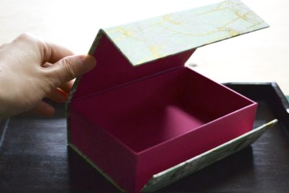
    A box of making with “nikawa” glue.
    Outside paper is Nepalese handmade paper called Lokta paper.
    The pink paper inside is Tanto, a Japanese industrial paper.
    膠で作った箱。
    外側はネパールの手漉き紙、ロクタペーパー。
    ピンクの内側の紙は日本の工業紙のタント。

    The update had stopped for a while.
    Because I had making my workspace.
    Finally it was finished.
    This should make my work go smoothly.

    Now, my challenge in July is to use “nikawa” glue.
    I got it from my kindly friend.
    I’m happy to have many good friends.

    しばらく更新が止まっていました。
    作業場を作っていたのです。
    やっとそれが完成しました。
    これで、作業効率が良くなるはず。

    さて、7月の試みは”膠(ニカワ)”を使うことでした。
    親切な友人がプレゼントしてくれたのです。
    良い友人達に恵まれて、私は幸せです。

    Box&Needle’s label.
    ボックス&ニードルのラベル。

    What I received was a glue from a store called Box & Needle in Kyoto.
    This is a Long-established carton store.
    This Haribaco making kit is also a product of Box & Needle.
    Both are traditional boxes made by sticking paper on cardboard,
    but the method of making is different between Cartonnage in France and “Haribako” in Japan.
    The biggest difference is the place of spread glue.
    In Cartonnage, glue is applied to cardboard, and in Haribako, glue is applied to the paper.
    Now, let’s make a Haribako using glue!

    私がいただいたのは京都にあるBox&Needleというお店の膠です。
    こちらは老舗の貼箱のお店。
    この貼箱制作キットもBox&Needleのものです。
    どちらも厚紙に紙を貼って作る伝統的な箱ですが、
    フランスのカルトナージュと日本の”貼箱(ハリバコ)”では作り方が異なるそうです。
    最大の違いは糊を塗る場所です。
    カルトナージュでは厚紙に糊を塗り、貼箱では紙の方に糊を塗ります。
    それでは、膠を使って貼箱を作ってみます!

    Vacuum packing of glue.
    I cut the glue together with the pack.
    I expected it to be sticky, but it’s not.
    真空パックされた膠。
    パックごと膠を切りました。
    べとつくことを予想していましたが、そうでもない。
    The cross section of glue.
    It was easy to get out of the pack.
    Not sticky.
    膠の断面。
    パックから簡単に出せました。
    べとつかない。
    It’s hard elastic.
    It isn’t sticky.
    硬めの弾力があります。
    べとつきはしません。
    Cut into bite-sized pieces.
    一口大にカット。

    First, I follow the manual.
    Cut into small pieces to melt the glue quickly.
    It says bite-sized, so I do that.
    I write that it is not sticky, but I expected the nikawa to be sticky.
    Because it’s glue. I thought the glue was sticky.


    まずは説明書のとおりにいきます。
    膠を素早く溶かすために小さく切ります。
    一口大と書いてあるので、そのとおりに。
    しつこくベトベトしないと書いていますが、膠がべとつくことを予想していたのです。
    だって糊ですからね、糊はべとつくものだと思い込んでいました。

    Add water.
    水を加えます。

    Add a quarter of the amount of water in the nikawa.
    It is easy to burn, so put it in a container and boil it in hot water.

    膠の1/4の量の水を加えます。
    膠は焦げやすいので、容器に入れ湯煎にかけます。


    It begins to melt soon.
    すぐに溶けはじめました。
    It’s a small change, but I’ll post a photo for my record.
    小さな変化ですが、記録のために載せておきます。
    When the solid becomes smaller, mix it with a brush to make it completely liquid.
    固形が小さくなったら、刷毛で混ぜ、完全に液体にします。
    The nikawa is ready.
    Oh, This is nikawa.
    膠の準備ができました。
    これが膠なんですねぇ。

    At this time, I moved from the kitchen to the workshop.
    next stage is a making a box.
    But…

    この段階で、台所から作業場へ移動しました。
    次は箱を作ります。
    ところが…

    The glue has already begun to solidify.
    膠がすでに固まりはじめていました。
    This needs to be melted again.
    これはもう一度溶かすしかないですね。
    Try to keep it warm to keep it melted.
    溶けた状態を維持するため、保温してみました。

    I couldn’t take a picture of the paper pasting work.
    Because it was a battle against time.
    When I lifted the brush and the temperature, it began to harden.
    When I think later, I should have increased the water.

    紙を貼る作業の写真は撮れませんでした。
    時間との戦いだったからです。
    刷毛を持ち上げ温度が下がると、固まりはじめました。
    後から考えると、水を増やせばよかったのでしょう。

    Since it hardened during gluing, the glue was unevenly attached.
    The paper became uneven.

    糊づけの最中に硬化が始まったため、糊が不均一につきました。
    そのため、紙が凸凹しています。
    I managed to finish making the box.
    なんとか箱作りは終了。
    Wrap and store the remaining glue.
    残りの膠は包んで保存します。

    Glue is peeled off by heat and moisture.
    The instructions said that you could re-paste it with steam.
    I tried it.
    But, the paper didn’t peel of.
    The nikawa is strong.
    It’s a good idea to add more water to slow down the cure.
    I’ll try again.

    膠は熱と水分で剥がれます。
    説明書にはスチームで紙を剥がすことができると書かれていました。
    試してみましたが、紙を剥がすことはできませんでした。
    膠は強力な糊でした。
    硬化を遅くするためにもっと水分を加えると良いのでしょうね。
    また挑戦するつもりです。

  • Twin binder for “Shiga shiga”

    Twin binder for “Shiga shiga”

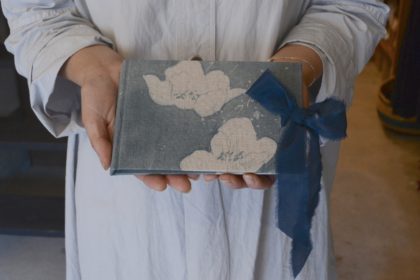
    It is a hand-dyed cotton cover.
    The ribbon is silk.
    手描き染めの綿布を表紙にしました。
    リボンはシルクです。

    I received a full order.
    It’s a binder for customers to write their name and address.
    This time, I made it using her favorite cloth.
    Twin binders were born from the cloth.
    フルオーダーを承りました。
    お客さまのお名前と住所を書いていただくためのバインダーです。
    今回は、彼女のお気に入りの布を使って作ることに。
    その布から、双子のバインダーがうまれました。

    Twin binders.
    These are different colors.
    双子のバインダーを色違いで。
    I took these on the product shelf.
    商品棚で撮らせてもらいました。
    I attached the metal fittings.
    The wooden pen is nice.
    金具を取りつけました。
    木のペンが素敵。


    The shop name is “shiga shiga“.
    It’s organic products shop at Yame.
    In addition to organic products such as organic cotton and linen clothes,
    natural cosmetics and detergents, and herbal teas,
    we also have tableware, accessories, and interior items selected by the owner.
    お店の名前は”shiga shiga“(シガシガ).
    オーガニック商品を取り扱う八女のお店です。
    オーガニックコットンやリネンの洋服、ナチュラルコスメや洗剤、
    ハーブティーなどのオーガニック商品のほか、
    店主の選んだ食器やアクセサリー、インテリアなどが並んでいます。

    It is a wonderful space with dried flowers and fresh flowers.
    ドライフラワーや生花が飾られている、素敵な空間。
    Who will write first?
    誰が一番に書くんだろう。

    It just opened in March of this year.
    Please come visit her when you come to Yame.
    今年の3月にオープンしたばかり。
    八女にお越しの際には、ぜひ足をお運びください。

  • A paper file prototype

    A paper file prototype

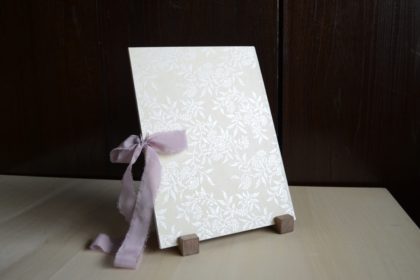
    The cover is a print lokta paper.
    表紙はプリントロクタペーパー。

    This is a paper file ordered from my calligraphy friend.
    My friend is studying Chancelière les minuscules now.
    I have learned bookbinding with her,
    and I am learning about material information and how to use the camera.
    This order file is for keeping A4 size practice paper.
    All designs are at her choice.
    The cover is a Nepalese handmade print lokta paper.
    The ground color is off-white and a white pearl plant pattern is printed.
    The inner paper is a Japanese industrial paper called Mofuru.
    The material of the ribbon is silk.
    カリグラフィー仲間によるオーダー品の紙ばさみです。
    現在、友人はシャンセリエール小文字体を勉強中とのこと。
    彼女とは製本を一緒に学んだことがあり、
    素材の情報やカメラの使い方などを教わる仲です。
    今回オーダーファイルは、A4サイズの練習した紙を保管するためのもの。
    彼女の選んだものが形になりました。
    表紙はネパールの手漉き紙であるプリントロクタペーパー。
    地色はオフホワイト、ホワイトパールで植物柄のプリントがしてあります。
    内側は日本の工業紙モフルです。
    リボンの素材はシルクとなりました。

    I noticed when I started making it.
    I didn’t know which shape is easy to use.
    How big is the body?
    How wide should it be?
    Where is the position of the ribbon?
    That’s why this is a prototype.
    I will improve it.
    I will sell it when a good product is completed.
    作り始めて気がつきました。
    使い勝手の良い形がわからなかったのです。
    本体のサイズは?
    幅はどれくらいいる?
    リボンの位置は?
    というわけで、これは試作品。
    これから改善していきます。
    良い形が完成してから、販売していくつもりです。

  • Learn manuscripts

    Learn manuscripts

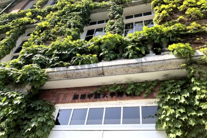
    Seinan gakuin university museum. This is the entrance.
    The building with impressive red bricks and ivy.
    西南学院大学博物館入り口。赤レンガと蔦が印象的。

    I went to Seinan gakuin university museum to learn Manuscript Studies
    I want to know accurate information.
    Because I found the wrong information in a bookbinding magazine.
    写本学を学びに西南学院大学博物館へ行きました。
    製本の雑誌で間違った情報を見つけてしまい、正確な情報が欲しいと思ったのです。

    I took an extension course at the university museum.
    This is the text.
    I was happy to got souvenir postcards.
    大学付属博物館の公開講座を受講してきました。
    これはそのテキスト。
    お土産にポストカードをいただいて嬉しかったです。
    The hall where lectures are held.
    Red bricks are used in the building.
    講義が行われるホール。
    建物の中に赤レンガが使われています。
    Seinangakuin university museum.
    It was built in 1921.
    西南学院博物館。
    1921年建造。

    This time it was an introduction, but it was very a fulfilling lecture.
    Unfortunately, the content about the shape of the letters was skipped.
    I wanted to know most it.
    It was so good the lecture of a illumination.
    I can expect on next time.
    Here are some books about manuscripts.
    今回は概論だけでしたが、非常に充実した内容でした。
    残念なことに、書体に関する内容は飛ばされてしまいました。
    一番それが知りたかったのです。
    写本装飾に関する部分がとてもよかったです。
    次回に期待が持てます。
    写本に関する本をいくつかご紹介します。

    I bought two pictorial records this time.
    Contains sacred images of 19th century Mexico and Philippines.
    All most of manuscript is Bible.
    I must know Christianity.
    今回、図録を2冊買いました。
    19世紀のメキシコとフィリピンの聖画像まで集録されています。
    写本の多くは聖書なので、キリスト教について知る必要があります。
    [Historical Scripts: From Classical Times to the Renaissance]
    Written by Stan Knight
    Translate by Toshiyuki Takamiya
    This book is all monochrome. But it is good to have the whole pages and enlarged photos.
    The content focuses on the shape of the letter.
    『西洋書体の歴史 古典時代からルネサンスへ』
    著 スタン・ナイト
    翻訳 高宮 利行
    この本は全てモノクロですが、一頁の全体と拡大写真が載っているところが良いです。
    書体の形に注目した内容になっています。
    [THE ART & HISTORY OF Calligraphy]
    Written by Patricia Lovett
    This edition published in 2020 by The British Library
    This book has the best information.
    It’s all page colors.
    Explains how to make manuscripts, materials, tools, and how to write letters.
    Moreover, it covers everything from papyrus codex to contemporary calligraphy works.
    It’s a great book!!
    『書道の芸術と歴史』
    著 パトリシア・ラヴェット
    2020年 英国図書館 発行
    この本は最も良い情報が載っています。
    全ページカラー。
    写本の作り方、原材料、道具、文字の書き方まで解説されています。
    さらに、パピルスのコデックスから現代アートカリグラフィー作品まで網羅しているのです。
    素晴らしい良書!!

  • Bookbinding in the tea room

    Bookbinding in the tea room

    This is a room for the tea ceremony at “Ashiyagama no Sato” in Fukuoka Prefecture.
    Tea ceremony tools are on display.
    こちらは福岡県の“芦屋釜の里”の茶室。
    茶道具が展示されています。

    I went to “Ashiyagama no Sato” in Onga-gun, Fukuoka prefecture.
    To see an independent exhibition of an imoji.
    An “imoji” is a craftsman who casts with molten iron.
    “Ashiyagama no Sato is studying and making kettles used in the tea ceremony and temple bells.
    福岡県遠賀郡にある “芦屋釜の里” へ行ってきました。
    ある鋳物師(いもじ)の独立展を観るためにです。
    鋳物師とは溶かした鉄で鋳造する職人のことです。
    芦屋釜の里では茶釜や梵鐘を作ったり、研究したりしています。

    Yousuke Higuchi, an imoji.
    He will independent this spring.
    鋳物師の樋口陽介氏。この春に独立されます。

    I’d really like to tell about Ashiyagama teakettles, but I don’t have enough knowledge yet.
    I will tell you after studying more about it.
    This time, I will tell about “hyougu”, Hanging scrolls, folding screens, sliding doors, etc.
    芦屋釜についてお話ししたいのはやまやまなのですが、まだ知識が足りません。
    もっと学んでからお伝えしたいと思います。
    今回は、“表具”、つまり掛軸、屏風、襖についてです。

    I quote from a pamphlet.
    “The Ashiyagama originated in this town and was greatly renowned for its excellence as a utensil for the tea ceremony.
    The aim of Ashiyagama no Sato is to preserve its history,
    promote the revival of the Ashiyagama and tea culture and provide a peaceful environment and gathering place.”
    You can drink matcha here. The History Museum is across the street.
    I had no time, I couldn’t drink tea and to see history museum. I will visit again.
    パンフレットからの引用です。
    “芦屋釜はこの地で育まれ茶の湯 釜の名品として名を馳せました。
    当園は、その歴史にふれ、芦屋釜の復興や茶の湯文化の振興をはかるとともに、
    多くの人々が集うやすらぎの場所となることをめざしています。”
    ここでは抹茶がいただけます。通りの向かいは歴史民俗資料館です。
    私は時間が足りず、抹茶はいただけなかったし、歴史民俗資料館も見れず。また行こうと思います。
    This is “furosaki-byoubu” .
    It’s placed behind the tea ceremony tools.
    これが風炉先屏風です。
    茶道具の後ろに置かれています。

    At one time, there was not a bookbinder as Europe in Japan.
    Instead of the bookbinder, there is the “hyougusi”.
    The hyougusi is a professional in paper and glue.
    Actually, I am weak in paste work.
    That is why, I’m interested in paste(glue) work.
    Then I arrived at the hyougusi.
    かつて、日本にはヨーロッパのような製本職人はいませんでした。
    製本職人の代わりに、表具師がいます。
    表具師は紙と糊の専門家です。
    実をいうと、私は糊付け作業が苦手なのです。
    そういう理由から糊付け作業に興味をもち、表具師に行きつきました。

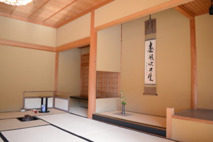
    It’s a tea room called “Ginputei”
    Japanese calligraphy sing.
    Read form right to left.
    茶室 吟風亭。和書の名札。右から左に読みます。
    Inside Ginputei.
    A hanging scroll is hang in “tokonoma”.
    吟風亭内。
    床の間には掛軸。
    Japanese paper is stuck on the wall.
    壁に貼られているのは和紙。
    This is a sliding door made of wood and paper, “shouji”.
    The sunlight is transparent.
    木と紙でできた引き戸、障子。
    陽の光が透けます。

    Calligraphy is displayed in Japanese tea room.
    What if you want to decorate Western calligraphy?
    How should I make it a hanging scroll.
    I’m thinking about that.
    日本の茶室では書が掛けられています。
    もし西洋カリグラフィーを飾るなら?
    どのように掛軸にしたらいいのだろう?
    そんなことを考えています。

    This is a “jibukuro”.
    It has a sliding paper door.
    Because the area is small, it is a beautiful blue that accents the interior.
    地袋。紙の引き戸がついている。
    面積が狭いので、内装のアクセントになるような綺麗な青でした。
    Wave pattern.
    Is it because the sea is near here?
    波の模様。ここは海が近いからでしょうか?
    It’s “fusuma”.
    Pine leaf pattern.It also expresses the broken leaves.
    これは襖。松葉模様。葉の折れも表現されています。
    Silver on a white background.
    Since the area is large, it probably uses inconspicuous colors.
    白地に銀色。面積が広いので目立たない色使いをしているのでしょう。

    The paper used for fusuma is called “Karakami”.
    There seems to be a “hyougusi” who makes this paper.
    Use pigments and glue.
    (Glue here too!!)
    襖に使われている紙を唐紙と言います。
    唐紙を作る表具師もいるようです。
    これは顔料と膠を使います。
    (ここでも糊が!!)

    This hanging scroll is like a picture of a willow.
    この掛軸は柳の絵のようです。

    Not only calligraphy but also Japanese paintings are used as hanging scrolls.
    The world of Japanese paper and glue seems to be deep.
    I will continue to study.
    I will keep a record here each time.
    書だけでなく日本画も掛軸に用いられます。
    日本の紙と糊の世界は深いようです。
    勉強し続け、その都度記録をここに残すつもりです。

    Wisteria was in full bloom this time.
    It seems that you can enjoy seasonal flowers here.
    今回は藤が見頃でした。
    季節ごとの花が楽しめるようです。

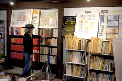
  • Musée blanc Yame preview

    Musée blanc Yame preview

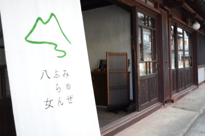
    The front of Musee blanc Yame.
    Noren is a sing of opening.
    みゅぜ ぶらん 八女の正面。
    暖簾がオープンの印。

    A preview was held on March 31st.
    I would like to keep that state.
    3月31日に内覧会が行われました。
    その様子を残しておきたいと思います。

    Collectibles other than books are also displayed.
    I am interested in overseas printed matter.
    本以外の収集品もディスプレイされています。
    海外の印刷物が気になります。
    It is decorated with French and Japanese antiques.
    This trumpet makes a sound 😉
    フランスと日本の骨董品が飾られています。
    このトランペット、ちゃんと音が出るのです 😉

    The weather was nice on this day.
    The entrance door was open and a pleasant breeze was blowing through.
    There is also a courtyard in the form of buildings in the area.
    But I couldn’t take a good picture.
    I’m sorry I couldn’t show you.
    Please come visit.
    この日は天候にも恵まれました。
    入り口のドアは開け放たれ、心地よい風が吹き抜けていました。
    この地方の建物の形式で中庭もあります。
    ですが、私にはうまく写せなかったので、お見せできなくて残念です。
    代わりに、ぜひ、足をお運びくださいね。

    Paste paper note.
    I made them.
    It is sold at the library.
    ペーストペーパーのノートを作りました。
    こちらの図書館で販売中。
    I used Yame handmade paper to endpaper.
    That was also a request.
    八女和紙を使って、というご依頼にお応えして、見返しに使用しました。


    I received an order for a notebook as a thank-you gift for the visitors.
    The colors ordered by the library are cherry blossoms, wisteria, and green tea (Yame is famous for green tea).
    Another request was to use local handmade paper.
    I used Japanese paper that cannot be bound by a machine.
    Bookbinding that can be done because it is hand-bound.
    I would like to respond to such requests.
    来館者へのお礼の品としてノートのご注文をいただきました。
    桜、藤、緑茶(八女はお茶が有名です)がご依頼の色でした。
    もう一つの依頼は八女和紙を使うこと。
    そこで、機械では使うことができない和紙を使いました。
    手綴じだからできる製本です。
    このようなご依頼にもお応えいたします。

    I made different colors of the original stationery.
    オリジナル文房具の色違いも作りました。

    The different colors of the original stationery have been completed.
    Last time it was a combination of blue and yellow.
    The new color is a combination of black and red.
    I’m improving it little by little.
    Click here for product inquiries, To Musee blanc Yame.
    オリジナル文房具の色違いが完成しました。
    前回は青と黄色の組合せでした。
    新色は黒と赤のコンビネーションです。
    少しずつ、改良を重ねています。
    商品に関するお問合せはこちら、みゅぜ ぶらん 八女様まで。

  • Musée blanc Yame’s stationery

    Musée blanc Yame’s stationery

    Junichi Hisatsuka, Professor Emeritus of Waseda University.
    In front of the collection.
    The point of sight is a rare French book.
    早稲田大学名誉教授、久塚純一氏。
    蔵書の前にて。
    視線の先はフランスの希少本。

    I received full-order by Musée Blanc Yame.
    Musée Blanc Yame is a private library.
    The owner is Mr. and Mrs. Hisatsuka.
    Mr.Hisatsuka is Professor Emeritus of Waseda University.
    He is an expert in social security law.
    みゅぜ・ぶらん八女という私設図書館からフルオーダーの依頼をいただきました。
    みゅぜ・ぶらん八女のオーナーは久塚夫妻です。
    久塚氏は早稲田大学の名誉教授で、ご専門は社会保障法。

    The front of the library.
    図書館の正面。
    Valuable materials on social security are stored.
    社会保障学の貴重な資料が保管されている。
    Books are lined up in an old Japanese house.
    日本の町屋に本がずらりと。
    Books on the second floor.
    2階も。
    There are also many photo books and cameras.
    たくさんの写真集にカメラ。

    They also have connections with photographers and are thinking about photography events and exhibitions.
    It will be rented as an exhibition or event venue.
    写真家との繋がりもあり、写真展や写真に関するイベントなども考えていらっしゃるそうです。
    展示やイベント会場として貸出も可能。

    These photos taken by their daughter.
    She is a photographer.
    Her husband is also a photographer, Mr. Yang Seungwoo.
    娘さんの撮られた写真。
    娘さんは写真家だそうです。
    その夫もまた写真家で、梁丞佑氏。
    The work of photographer Yoshino Oishi.
    大石芳野氏の写真。
    Signed by photographer Yoshino Oishi.
    大石芳野氏のサイン入り。
    Yoshino Oishi Photobook.
    ”Memory of the war”
    大石芳野写真集『戦禍の記憶』

    These are order stationary.
    These are original products of Musée Blanc Yame.
    Sold only at this private library.
    It’s paper file and report pad.
    こちらが依頼の文具。
    みゅぜ・ぶらん八女のオリジナルで、
    こちらの私設図書館でのみ販売いたします。
    紙のファイルとレポートパッドです。

    Official postcards, sticky notes, card holders and paper clippers.
    官製はがき、付箋、カード入れと紙挟み。
    back style.
    後ろ側。
    Report pad version.
    レポートパッドバージョン。
    File. Contains A5 size.
    A5サイズが入るファイル付き。
    A5 size report pad refill.
    Binding by hand.
    A5サイズのレポートパッドリフィル。
    手綴じです。
    Can be resized.
    サイズ変更可能。

    A preview will be held on March 31st.
    Click here for a link to the Facebook event page →
    I am also in the library on this day. I hope to see you.
    3月31日に内覧会が開催されます。
    Facebookのイベントページへはこちらからどうぞ →
    この日は私も在廊いたします。
    お待ちしております。

  • Bon voyage hand dyed yarn’s book

    Bon voyage hand dyed yarn’s book

    This book is square concertina.
    It’s 19 centimeters wide and long.
    正方形のコンチェルティーナブック。
    縦横19㎝です。

    I received a semi-order.
    It’s a square concertina book.
    The text is black.
    The cover is white.
    She had a clear image from beginning.
    Her name is Shino.
    And her shop name is Bon voyage hand dyed yarn.
    She is a maker of hand-dyed yarn.

    セミオーダーをいただきました。
    スクエアのコンチェルティーナブックです。
    本文は黒。
    表紙は白で。
    彼女は初めから明確にイメージをされていました。
    お名前をShinoさんと言われます。
    そして、彼女の屋号が Bon voyage hand dyed yarn
    (ボン ボヤージュ ハンド ダイド ヤーン )。
    手染め毛糸の作家です。

    I chose these yarns.
    Their name is “Ayutthaya the long night”
    私が選んだ毛糸。
    名前は ”アユタヤ 長夜 “
    I am knitting a blanket with “Ayutthaya”.
    “アユタヤ” で膝掛けを編んでいます。

    Her yarns has one by one names, has one by one tales.
    These are born when she was inspired a scenery of journey.
    Sometimes what she feels every day becomes a tale, the color of the yarn.
    I made a book to include the tales.
    彼女の毛糸には一つ一つに名前があり、一つ一つに物語があります。
    それらは、旅先で見た景色から生まれます。
    時には、日々感じたことが物語になり、毛糸の色になります。
    その物語を収める本を作りました。

    If you could meet her, you might be able to read the book.
    Because she usually sales web shop, it’s rare for she opens a shop at a face-to-face event.
    You can also read the tales on her web shop.
    (Click on the web shop on her Instagram profile.)
    If you read the tales, you’ll want to knit.
    Let’s knitting your story.
    Bon voyage!!
    もし、彼女に会うことができたなら、その本を読むことができるでしょう。
    ふだんはウェブショップで販売しているので、彼女が対面イベントに出店することは珍しいのです。
    物語はウェブショップでも読むことができます。
    (彼女のインスタグラムプロフィール上のウェブショップをクリック)
    物語を読んだら、編み物がしたくなりますよ。
    あなたの物語を編みましょう。
    良い旅を!!