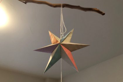
Star. This place is a yoga studio and an atelier of artwork. The owner of this studio is Yogini and an artist. 星。 この場所はヨガスタジオでもあり、アートワークアトリエにもなります。 このスタジオのオーナーはヨギーニであり、アーティスト。
I have a lot of things I want to write, but take a break first, not in chronological order. 書きたいことは溜まっていますが、 時系列ではなく、先に休憩を。
A dictionary recommended by her. The typefaces of various old books have been collected. 彼女の推薦辞書。 様々な古い書物の書体が採取されています。
Take a look at her portfolio. Graphic design that looks at the mind and body adjusted by yoga. I was sleepy at the end of yoga. And during the last resting pose, I experienced a mysterious sleep. According to the teacher, it is proof that I was completely weakened. I felt like I was sleeping and awake. It was a sleep with clear thoughts. It was a feeling I had never experienced before, so I wanted to record it.
The photos this time were taken with an iPhone. I had a single-lens reflex camera, but I didn’t put it out. 今回の写真はiPhoneで撮影。 一眼カメラを持っていたのに出すこともなく。
Facebook informed me that I met her four years ago. It was just this season. In addition, I visited this atelier at this time of 2019. I feel like I’ve been connected to the present since three years ago.
This is 3 years ago. There are many driftwoods and dried plants in her atelier. At that time, it was difficult to relax. これは3年前。 彼女のアトリエには流木やドライになった植物がたくさんあるのです。 あの頃は、力を抜くのが難しかったなぁ。Whenever I go to her, I go to this restaurant with her. I am satisfied with the delicious meal that uses plenty of fresh ingredients. 彼女を訪ねると、いつも一緒にこのレストランへ。 新鮮な食材がふんだんに使われた美味しい食事、毎回満たされます。
I want to be a bookbinder in town. I am thinking of receiving an order to manufacture a book that is not suitable for mass production. I would like to receive an order for repairing books that are not cultural properties. I want to sell notebooks and make custom-made books. I’m very happy if you think that a town with a bookbinder is nice. I’ve been rushing until now, but it was an event that made me feel that I needed to get a little tidy toward my goal. Because there is no limit to bookbinding. What the world needs is not perfect binding. It is important to have good binding that is affordable and easy to use on a daily basis. Do not you think so?
I received a DM from the organizer. It is distributed to acquaintances in Fukuoka who are engaged in creative activities. Contact me if you want. 主催者からDMが届きました。 創作活動をしている福岡の知り合いに配っています。 欲しい方は私に連絡を、ぜひ。
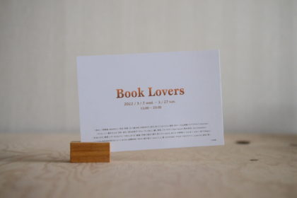
I entered my work in an exhibition. The is exhibition called “Book Lovers”, which is an exhibition of book art. It will be held at MOTOYA Book Cafe Gallery in Tokyo. It will be held from March 2nd to March 27th. You can also see the work online during the period. There are many authors other than me, so you should be able to enjoy it. If you can, go to the gallery, if you’re far away, go to the website, and if you’re creating, join us next time.
展示会に出品しています。 それは ” Book Lovers ” というブックアートの展覧会です。 東京にあるMOTOYA Book Cafe Galleryにて開催されます。 開催期間は、3月2日−3月27日。 会期中はオンラインで作品を見ることができます。 私以外の作者がたくさん出品されているようですし、きっと楽しめるはずです。 可能な方は会場へ、遠方の方はwebサイトへ、 そして、もし、創作活動をしているのならば、次回はぜひ参加を!
I had released it 2019 may. However, there was an undisclosed special binding version. It’s a hardcover binding. This work needs paper knife to read. I had a craftsman make a bamboo paper knife for this book. It has the shape of a drop that can be used with both hands. This design also has meaning.
Title is printed by silk-screen same as softcover binding. Letters are intentionally blurred. タイトルはソフトカバー製本と同じくシルクスクリーン印刷です。 文字はわざと滲ませてあります。
The end paper was colored to match the photo. 見返しは写真にあわせて色付けしています。
Handmade paper for this book. Before the paper dries, it drops water and marks it. この本のために漉いてもらった特別な手漉き和紙。 落水紙といって、漉きたての紙に水を落とし痕をつけてもらいました。
The three end papers are Yame handmade Japanese paper. These also match the colors in the photo. It’s a very thin paper, and it’s a light color that you can see compared to white. 見返し紙3枚とも八女手漉き和紙です。 これも写真と色をあわせました。 とても薄い紙で、色も白と比べてわかるくらい淡いです。
This book is uncut. You will need a paper knife here. I planned to make a work using this structure. この本はアンカットです。 ここでペーパーナイフ登場。 アンカットを生かした本が作りたくて企画した作品です。
Double section. The keyword of this work is “2”. ダブルセクション。 この作品のキーワードは”2”。
The font used is Tsukushi typeface. I adopted the suggestion from the designer. This is a font that is particular about non-uniform Japanese shapes and spacing. And the point of this work is the emotions that attract each other. I imagine a relationship where the one and only two people fit perfectly. 使用フォントは筑紫書体。 デザイナーからの提案を採用しました。 これは均一ではない日本語の形とスペーシングにこだわったフォントです。 そして、この作品は二人の惹きあう感情がポイントです。 唯一無二の二人がぴたりと嵌る関係をイメージしています。
I use Japanese and English. Not a complete translation. Japanese and English have an auxiliary relationship. The layout of the letters also makes sense. 日本語と英語を使って表現しています。 完全な翻訳ではなく、双方が補助になっている部分があります。 文字のレイアウトにも意味を持たせています。
Strangely, it was exhibited in a work exhibition called Lovers. ” Love is a yearning to be one ” Ancient Greek philosopher Plato’s words. 奇しくも、Loversという展示への出品です。 ”愛とは一つになりたいという願いである” 古代ギリシャの哲学者プラトンは愛をそう説きました。
The second keyword is tears and drops. It expresses the sadness that two people who are attracted to each other cannot become one. They are just two people, and because they are two people, they can attract each other. Drops are tears of joy in finding a one-of-a-kind partner, love to pour, and tears of sadness that cannot be one. 二つ目のキーワードは”涙” ”雫”。 惹かれあう二人の一つになることができない切なさ。 二人はあくまでも二人であり、二人であるから惹きあうことができるという事実。 雫は、唯一無二の相手を見つけた喜びの涙であり、注ぐ愛情であり、一つになれない悲しみの涙です。
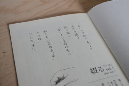
What is a book ? Spell the letter. Binding paper. It will be in the form of a book. The book we are looking for. What kind of book is it ?
The text in the frontispiece of “Tsuduru”‘s first issue. Fontworks‘s Kafu pen-style font is used. The word “tsuduru” has both meanings of writing sentences in a row and sewing paper for binding. It’s a word for making books. That is the origin of my shop name and the name of my publication. The design and DTP is creative works Grouper ( Yoko Futagami ) .
I wonder. Why do people want visual elements? Long before the word Mingei was born, we have been patterning earthenware. Not only the building, clothes and tableware, but also the serving of food is enjoyed by the eyes. What we are looking for is not only beauty, but also various kinds of pleasures such as coolness, cuteness, relaxation, and stimulation. In other words, we need more than just usability.
In my last blog, I mainly talked about concept setting and didn’t talk much about design. This time I would like to talk about the visual issue, design.
“Tsuduru” is a booklet that I edit and publish. I started making it for the purpose of popularizing a project that triggered the bookbinding. But when it comes to creating, “what is a book?” I was faced with the question. I can’t make it without answering this question. So I decided to put that question into shape. Since then, I have been publishing with the attitude of making books that I really want to make.
The first three book designs from Yoko Futagami. An image of calligraphy in the pink colored part. フタガミヨーコ氏からの最初の表紙デザイン3案。 ピンクに色付けされた部分にカリグラフィーが入るイメージ。
The cover of Volume 1 of “Tsuduru” expresses the etymology of the Chinese character 綴. The basic meaning is to connect disjointed things together. That is design A. It is the Chinese character of the radical that represents the thread. So, it has a special meaning of connecting with a thread. Plan B is a design that expresses the meaning of connecting with threads. In addition, the sound of Tsuduru’s “Tsudu” has the same roots as the Tsuduku’s( following , continue ) “Tsudu”. Both are words that describe disjointed things stick together and do not separate. From that meaning, design C represents the everyday life that continues.
All three were designed to express the etymology. But, all three have completely different designs. When you find something that suits your heart, it’s easy to decide. I chose design A at a glance. The first edition was 2017. I thought it was great at the time, but now that 2021 is nearing the end, I can finally talk about design. And I still fall in love with this design.
There were two conditions in the design of this book. One is to use handwritten calligraphy (not printing). The second is Japanese binding. The text inside is written vertically, so it is a book design with right binding. The binding thread pattern of the bookbinding is also considered as part of the design. Matching the content, binding, and design is also an issue of “Tsudurru”.
Encounter with Yoko Futagami from this book. From planning to publishing, she made zine “Irohani”. フタガミヨーコ氏と出会うきっかけになった一冊。 企画から出版まで彼女が作ったniche na zine 『いろはに』。
I was looking for a designer to make a booklet for the purpose of popularizing a project. I found her zine in my favorite bookstore. The name of the bookstore is taramu books & cafe. It’s a good bookstore, so I recommend checking it out. The owner introduced her to me. First of all, I was attracted to the design of the cover of this zine. A title logo that is not an existing font. Block pattern of watercolors. I felt that the color and the atmosphere of the typeface were in harmony.
“Irohani” frontispiece. The content is also very good. 『いろはに』の口絵。 表紙デザインはさることながら、内容もとても良かったのです。
The content of “Irohani” consisted mainly of interviews with local radio stations and electric companies. This issue is in the winter of 2016. It was the year when the electricity retail market was completely liberalized in Japan. And the opening of radio stations in this area is also in 2016. She interviewed herself about current affairs at the time and wrote an article carefully. The project I planned was aimed at supporting the reconstruction of the Kumamoto earthquake, so I asked her to interview the project. I thought her zine was good for making the project widely known. But unfortunately, this zine was the final volume. So, it was “Tsuduru” that she and I started together.
Advertisement for Kumamoto earthquake reconstruction support project, Nishiharamura fusuma arts & crafts project. This is described in Volume 1 of “Tsuduru”. Yoko Futagami is redesigning the advertisement I was making. Easy to read and well-balanced. This kind of sensibility is the ability of people who work in design. 熊本地震復興支援プロジェクト、西原村ふすまアート&クラフト プロジェクトの広告。 これは『綴る』vol.1に載せています。 私が作っていたものを、フタガミヨーコ氏がデザインしなおしてくれました。 それにより、読みやすく、バランスも整いました。 こういった感性が、デザインを生業にしている人の能力だと思います。
In the final issue of “Irohani,” Yoko Futagami wrote an article about what she was really interested in and designed it as she wanted. The medium of zine clearly expresses the person who created it. I fell in love with the design and content. This is probably because our philosophies and sensibilities are in agreement with each other. Therefore, the communication in the production of “Tsuduru” was very good. Next time, I would like to talk about a typesetting.
The morning of the second day of the event. イベント2日目の朝。
I haven’t blogged for a while. Because I managed the event and my bookbinding. The events name is Tsunagu marché. The event beginning was made by Craft tsunagu owner. she runs a craft store named Tunagu, she called out four of us. The first event holed last year December. At that time, we were restricted our actions. We only wanted a place to the action.
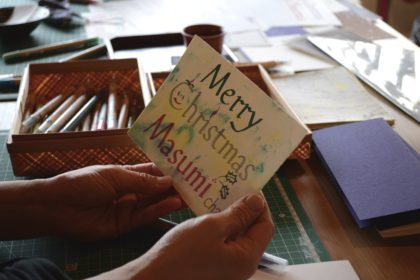
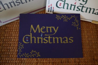
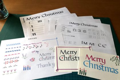
This is my booth at first event. I prepared a lot of Christmas cards of calligraphy for season. My calligraphy friend helped me. She wrote many cards for me. I just wanted show many people calligraphy. However, I couldn’t write a calligraphy card because I was busy binding. 最初のイベントの時の私のブースの様子。 季節に合わせてカリグラフィーのクリスマスカードをたくさん用意しました。 これらはカリグラフィー仲間の力によるもの。 私のためにたくさんのカードを書いてくれたのです。 手書きアルファベットを知ってもらおうと考えてはいましたが、 私は製本だけで精一杯、とてもカリグラフィーカードまで書く余裕がありませんでした。
Tsunagu means connecting what is separated. She named her shop Tsunagu. Because she wanted be connector to maker and user. And she connected us by this event. The frist Tsunagu marché had no time until hold. Anyway, let’s do it !! So we challenged. That time, I one more challenged. It’s flier design.
The first Tsunagu marché flier. The front. I used an application called Affinity Publisher. 1回目のツナグマルシェフライヤー。表。 使用したのはAffinityのPublisherというアプリケーションです。 This is the back. こちらは裏面。
Then, I will want to tell you why I had challenged flier design. Because, I started making books and had more opportunities to work with designers. I have an ambition to use calligraphy in my designs. Before that, I didn’t know if the design was good or bad… To do that, I first needed to know the design. Opportunity came around there. I got chance design Tsunagu marché flier. Designing a flier has taught me a lot. This is the record.
Tsunagu marché second flier. The front. ツナグマルシェ2回目のフライヤー。表。This is the back. その裏面。
Did I grow up by comparing the two. The first flier design helped me with the good photos taken by the members. If we use the work of the same member as the last time for this event image, we can’t use it because it seems to be the event of that maker. For that reason, the second flier design needed a photo shoot. What is needed here is image shooting. At this time, I learned that there are two types of advertising photos, image photos and product photos. (The story will be off, so I’ll talk about photos next time) Even if we ask a cameraman, we have to clarify the image of the event. No, shooting is also necessary, but styling is also necessary. I finally realized that everything was underpowered.
Cafe Nagykovácsi cookies. The black band on this wrap is the basis of the design. Nagykovácsi is a small town in Hungary. It is also a wonderful communication to ask the owner about the origin of the store name. カフェ ナギコバスキのクッキー。 包装の黒い帯がデザインの素になりました。 ナギコバスキはハンガリーの小さな町の名前です。 店名の由来を店主に聞くのも素敵なコミュニケーション。
Now, I have no choice but to do my best !! All we have to do is clarify and share the event image. Tsunagu marché is a joint management of five members. Actually, the first meeting with each other was at the time of the first event. Only Craft Tsunagu knew everyone. We had to spend a lot of time in a meeting to put together the opinions of the five people.
Jiji printing of silk screen printing shop. I went to see how the members are opening stores. The signboard is an antique clay tablet. It is painted with Kakishibu and printed on silk screen. シルクスクリーンの小さな印刷屋、jiji printing。 メンバーの出店の様子を見に行きました。 看板は骨董の粘土板だそう。 柿渋を塗り、シルクスクリーンで印刷してあります。
I would like to record how I faced the concept. The concept, which is also important in making works. The first, reconsidered the concept of the event. If the event get continue, needs reliable concept. Assuming that the event will continue as the members change, I wanted to decide on a concept that would not change easily and would apply to many people.
I also went to the riverbank looking for a place to shoot. A glass of Crafts Tsunagu. Blown glass was what inspired her to open the store. 撮影場所を探しに河原へ出かけたり。 これはクラフトつなぐのグラス。 吹きガラスがお店をひらくきっかけになった工芸品。
The reason why the members change is related to our lifestyle. There are tasks in life that should be prioritized over our own activities, such as childbirth, childcare and long-term care. Some of them may be working while working for a company. They are very important, and what you want to do is also very important.
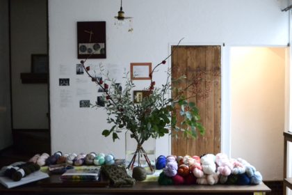
Members gathered with the keyword of handicrafts. Bon Voyage hand dyed yarn. Ayutthaya, my favorite color yarn. She does not sell knitted products, but dyed yarn. 手仕事を鍵に声をかけられたメンバーたち。 手染め毛糸作家 Bon Voyage hand dyed yarn. アユタヤという私の好きな色の毛糸。 編んだ製品を販売しているのではなく、染めた毛糸を販売しています。
Wouldn’t it be happy if you could find something worthwhile in a life without a fixed purpose? We wanted to keep up with what we finally found and wanted to do. For example, you can’t participate this time, but you can participate in the next event, or you can enjoy yourself as a customer even if you can’t open the next store. I wish I had a place to regain my original self. Isn’t everyone looking for a place of activity ? Just as we were looking for a place of activity as Tsunagu marché beginning. Then, I decided on the concept of connecting with my true self.
It’ me. Not all handicrafts were good. I searched for something in common so that I could respect each individuality. What kind of handicraft event is it? That is the character. これは私。 手仕事であればなんでもよかったわけではありません。 それぞれの個性を尊重できるように、共通するものを探しました。 どういう手仕事のイベントなのか?という性格の部分です。
Happily, this was accepted by other members. I was blessed with wonderful members and I should be grateful Actually, I didn’t make it based on a clear concept, but I saw it while searching for a flyer design. So, I think it came from all the members, not the concept I thought of alone. I felt that the invisible things were taking shape. The idea and shape are the same. It looks like the exact opposite, but it’s really one. I think this is the biggest realization I got when I was in charge of design.
Gallery Kashizuku at the venue. The owner of this gallery is a metal artist. She is a secret member of Tsunagu marché. 会場のギャラリー・カシズク。 このギャラリーのオーナーは彫金作家なのです。 ツナグマルシェの内緒のメンバー。
It was to bring the concept of the event to design. I learned that a good designer has a great ability to grasp the concept. I thought I knew it in my head (idea), but the fact that it comes with a real feeling is something that I can experience because I have a physical body (shape).
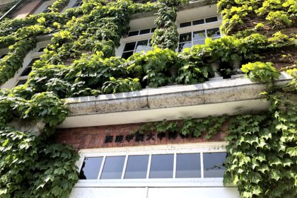
Seinan gakuin university museum. This is the entrance. The building with impressive red bricks and ivy. 西南学院大学博物館入り口。赤レンガと蔦が印象的。
I went to Seinan gakuin university museum to learn Manuscript Studies I want to know accurate information. Because I found the wrong information in a bookbinding magazine. 写本学を学びに西南学院大学博物館へ行きました。 製本の雑誌で間違った情報を見つけてしまい、正確な情報が欲しいと思ったのです。
I took an extension course at the university museum. This is the text. I was happy to got souvenir postcards. 大学付属博物館の公開講座を受講してきました。 これはそのテキスト。 お土産にポストカードをいただいて嬉しかったです。The hall where lectures are held. Red bricks are used in the building. 講義が行われるホール。 建物の中に赤レンガが使われています。 Seinangakuin university museum. It was built in 1921. 西南学院博物館。 1921年建造。
This time it was an introduction, but it was very a fulfilling lecture. Unfortunately, the content about the shape of the letters was skipped. I wanted to know most it. It was so good the lecture of a illumination. I can expect on next time. Here are some books about manuscripts. 今回は概論だけでしたが、非常に充実した内容でした。 残念なことに、書体に関する内容は飛ばされてしまいました。 一番それが知りたかったのです。 写本装飾に関する部分がとてもよかったです。 次回に期待が持てます。 写本に関する本をいくつかご紹介します。
I bought two pictorial records this time. Contains sacred images of 19th century Mexico and Philippines. All most of manuscript is Bible. I must know Christianity. 今回、図録を2冊買いました。 19世紀のメキシコとフィリピンの聖画像まで集録されています。 写本の多くは聖書なので、キリスト教について知る必要があります。 [Historical Scripts: From Classical Times to the Renaissance] Written by Stan Knight Translate by Toshiyuki Takamiya This book is all monochrome. But it is good to have the whole pages and enlarged photos. The content focuses on the shape of the letter. 『西洋書体の歴史 古典時代からルネサンスへ』 著 スタン・ナイト 翻訳 高宮 利行 この本は全てモノクロですが、一頁の全体と拡大写真が載っているところが良いです。 書体の形に注目した内容になっています。 [THE ART & HISTORY OF Calligraphy] Written by Patricia Lovett This edition published in 2020 by The British Library This book has the best information. It’s all page colors. Explains how to make manuscripts, materials, tools, and how to write letters. Moreover, it covers everything from papyrus codex to contemporary calligraphy works. It’s a great book!! 『書道の芸術と歴史』 著 パトリシア・ラヴェット 2020年 英国図書館 発行 この本は最も良い情報が載っています。 全ページカラー。 写本の作り方、原材料、道具、文字の書き方まで解説されています。 さらに、パピルスのコデックスから現代アートカリグラフィー作品まで網羅しているのです。 素晴らしい良書!!